


Color of the Year
February 8, 2024
Since this is the beginning of the year 2024, I would like to show you the color of the year from a few well-known painting companies.
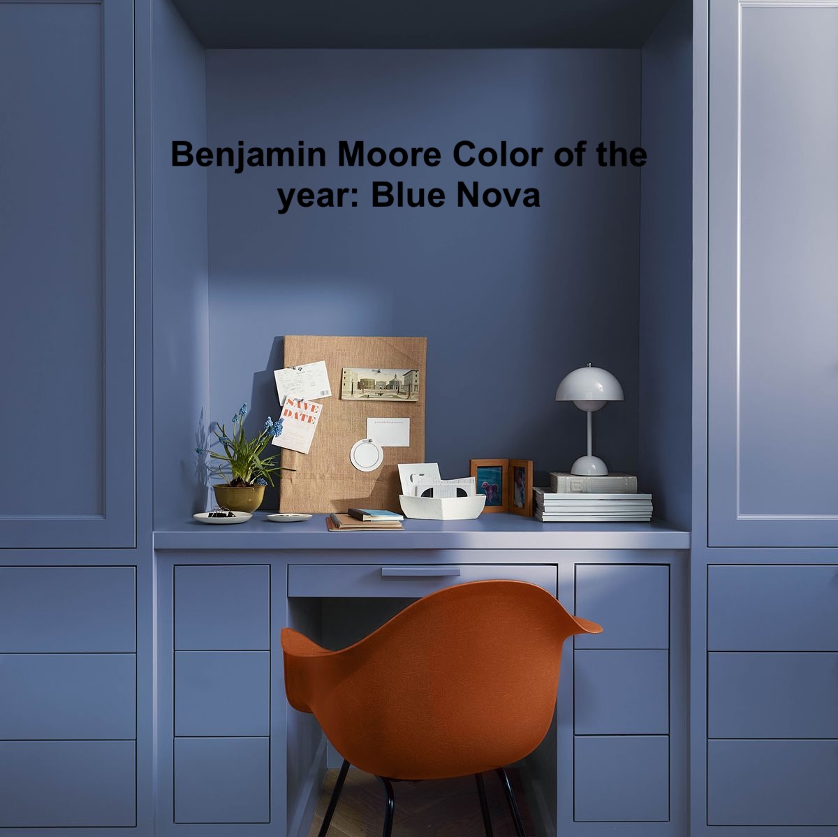
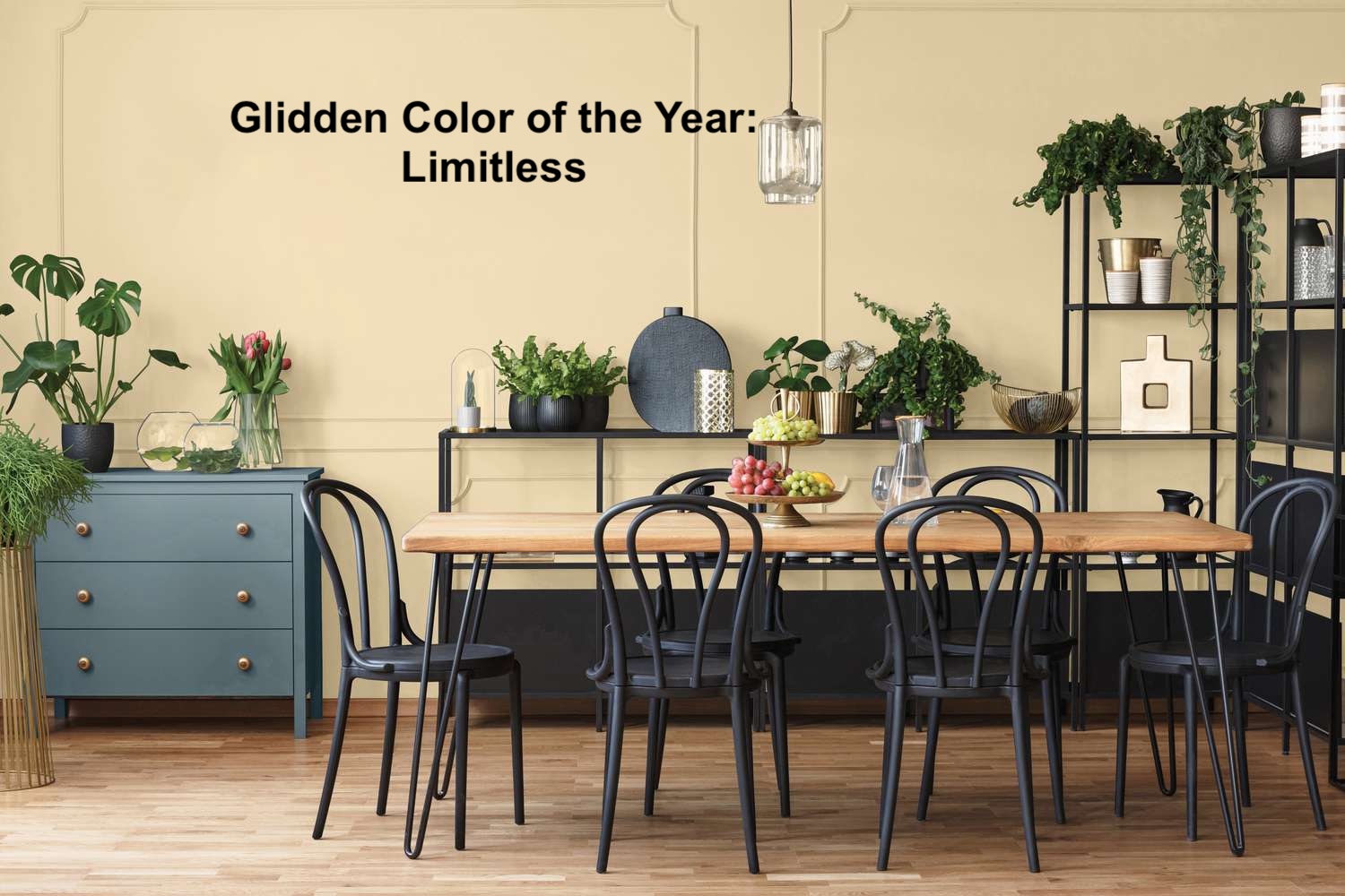
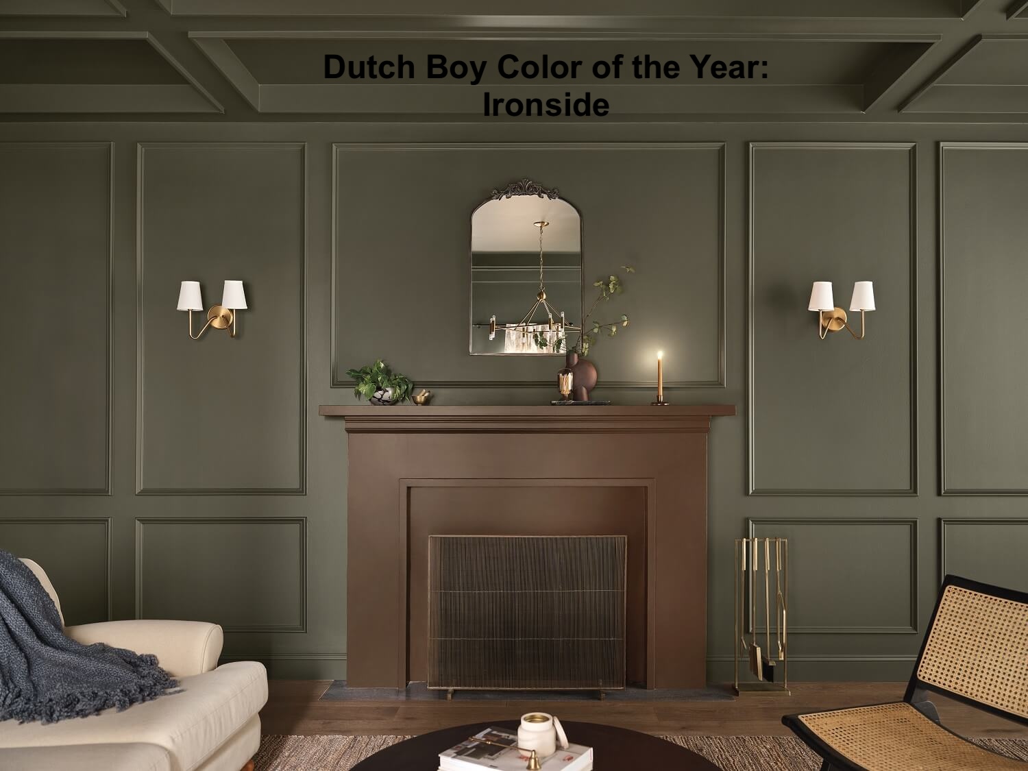


As you can see, blue hues are prominent. Warm neutrals, classic pastels, and earthy shades are all trendy.