Color Meaning And Emotions

May 22, 2025

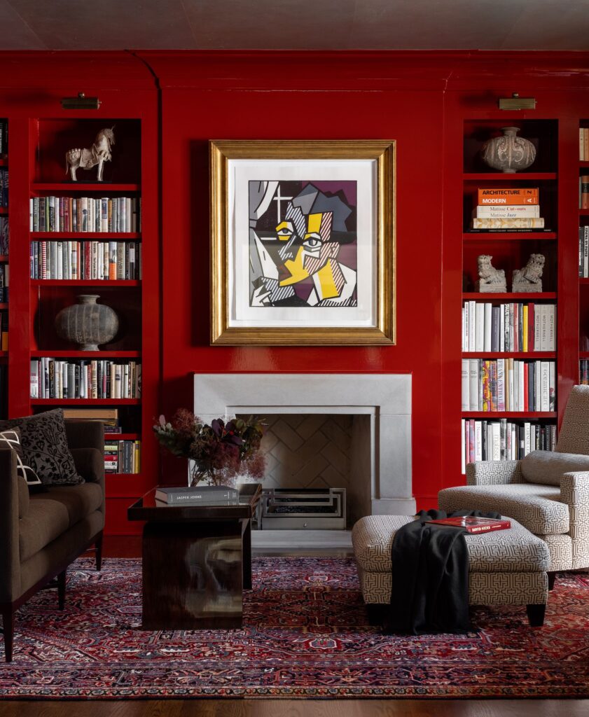
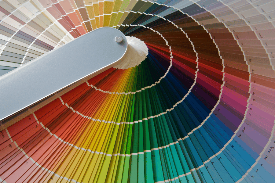
Red pumps the adrenaline like no other color, and it’s no wonder it stimulates the appetite…can anyone say red dining room? Red is so intense and tiring for the eyes that surgeons wear baby blue scrubs as an eye respite while working on the inside of the human body, which is blood red. Deep reds have a traditional feeling of importance and stature, and bright reds impart adventure. Brick red has an earthier feel and provides a classic, warm, understated look, while cherry red symbolize romance and energy. Either way, red will attract the most attention, so red is an excellent distracter in staging!


Orange is the color of enthusiasm, creativity, and warmth. It conjures up images of fast food and advertising. Orange can range from bright yellow oranges to deep terra-cotta and rust. Few use orange “as is” in large quantities, but orange is the source of many more workable hues. Rich oranges can be copper or paprika, which remarkably share the warmth of an earth tone and can be comforting and warm. Pale peach has a lovely, light accent.


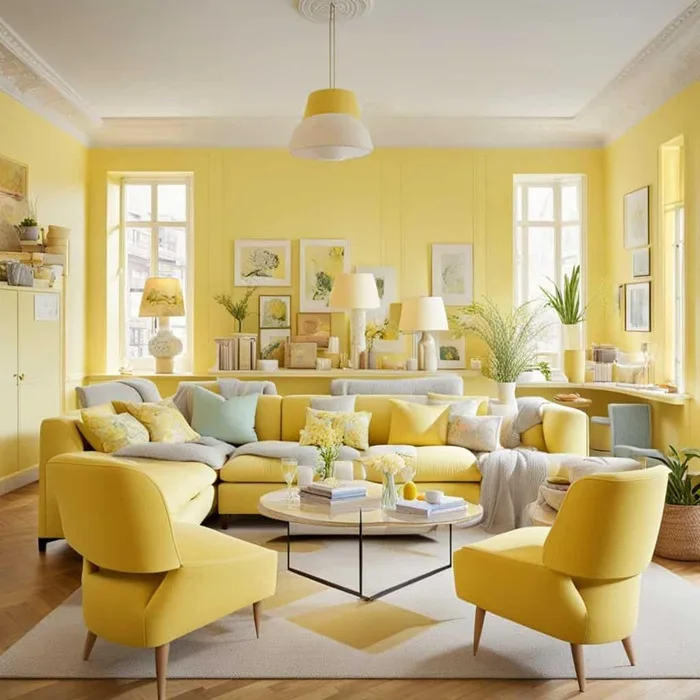
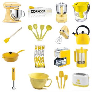
Yellow is welcoming, sunny, bright, and enthusiastic. There’s nothing like yellow to lift the spirits and lighten the mood: bold yellows and formal gold demand equally intense color companions like royal blue and crimson red. Bright yellows have a vibrating intensity that can be difficult on the eyes and are not suggested in young children’s rooms. Soft yellows with names like wheat, maize, and taffy are ideally suited to walls and furnishings where stronger colors might overwhelm them. Coordinating with almost any other color, soft yellows are easy to live with.


Green represents nature and can be tranquil, invigorating, restful, and balancing. It is relaxing and soothing, so it is used in places where people are comforted, whether it is a medical facility or a “green room” where people relax before a performance. Dark greens inspire a more conservative, traditional environment. Lighter, soft greens recall nature and soothing earth tones and look at home in almost any scheme, especially one that includes warm wood. Green is considered the fourth primary as it works well with almost any color.


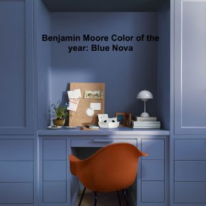
Blues are connected to both sky and water. They are associated with clear thinking and calm, meditative environments (think surgeon’s blue scrubs). Blue also invokes the qualities of loyalty, honesty, and clarity. Blue is a relatively broad color family, including hues as varied as cornflower, cobalt, and cerulean. Bright, breezy blues please children, while less intense versions satisfy more sophisticated tastes. Blue is the coolest color on the wheel, generally producing tranquil feelings and peaceful moods. It is my favorite bedroom color!


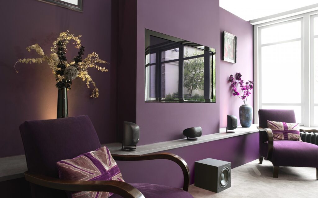
Purple brings luxury, wealth, sophistication, mystery, romance, and royalty to mind. This mix of emotions is common as some people view it as magical and mysterious, while others as dark and dreary associated with the Victorian era. Rich purples can be used in rooms of quiet elegance and convey a formal look combined with cream, gray, and black. Soft purples like lilac and lavender can be more feminine and create a feeling of splendor, style, and light-hearted romance. The light hues go particularly well in bedrooms or children’s rooms where the mood is cooling, romantic, or whimsical.


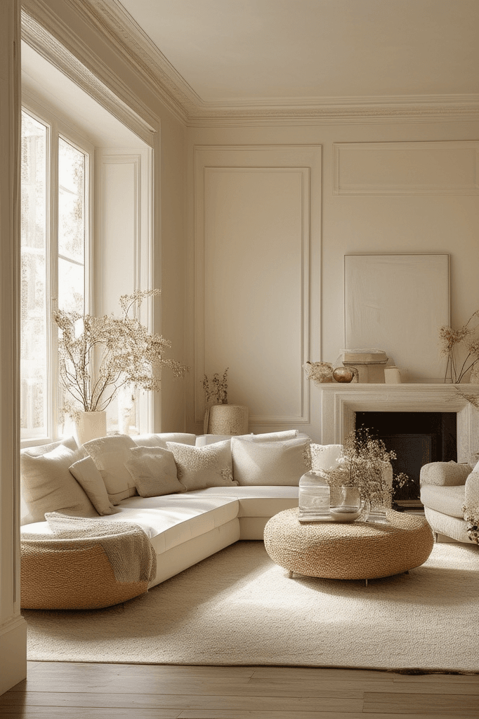
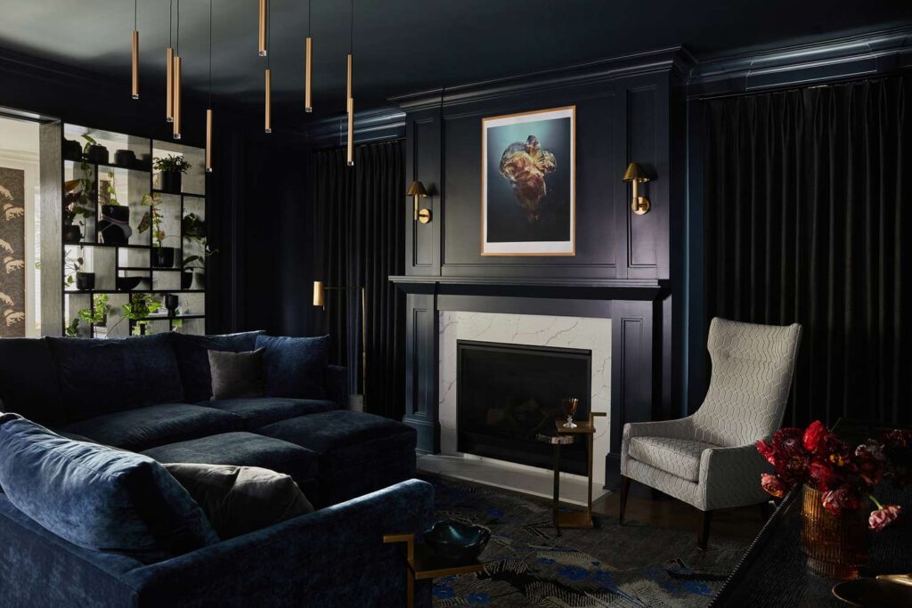
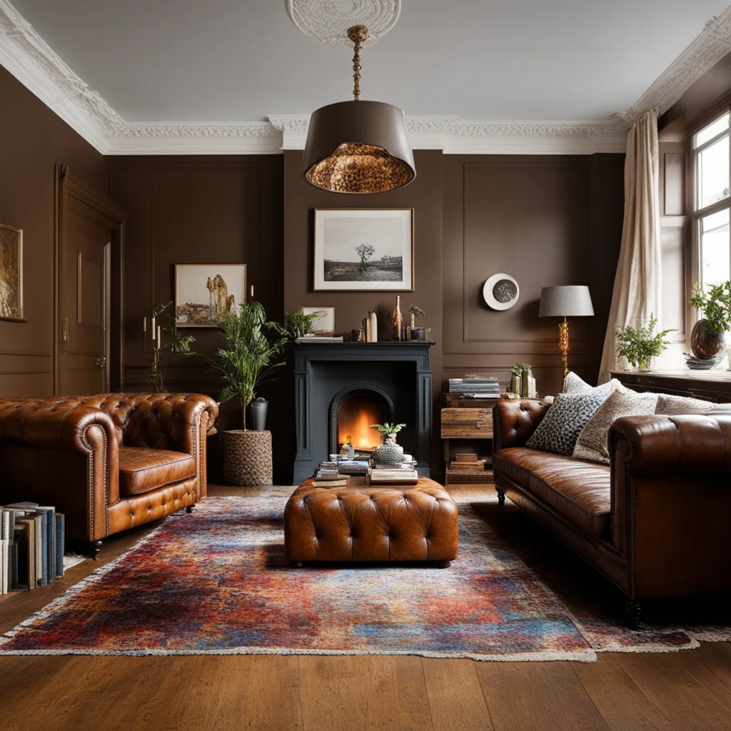
Neutral colors like white (purity and freshness), black (understated elegance, power, and strength), and brown (stability, security, and comfort) work wonders in any color scheme.


The Hallmark Of A Beautiful Room

April 10, 2025

There are seven elements to creating a Beautiful Room. Consider these elements and ask yourself if you have met all these requirements.

  1. Balance: Have you achieved balance? Horizontally? Vertically? Color? (three zones?)Texture? (all the same finishes in your accent pieces?) Metal? Is it all satin? bronze?
  2. Harmony: The way the rooms flow together. Do they tell a story or is it chopped up?
  3. Proportion: The way things relate to one another. Ex: Is the lamp the best proportion to the table?
  4. Scale: The way things relate to the room. Ex: Is the sofa the right scale for the room? Or is it too big? Too small?
  5. Color: Does it hit the three zones? Function one 0″-36″ Power  Z0ne  36″-78″  Ceiling  Zone  78″  to  ceiling.
  6. Rhythm & Flow: Keeps the room moving. This is where you’re going to repeat things. Be true to the form. Ex: Round table has round table mat, round accessories. Doesn’t mean everything in the room has to be round!
  7. Style: Does it have flair and have you honoredwhat it is you are trying to achieve?

Color Specialist

March 27, 2025

Most people don’t think too much about color when designing a space, but color is the fundamental building block of design. Choose the wrong color, and nothing will work.

Years ago, I took a course in color and learned quite a bit. The system I learned is based on science—yes, science!! It involves combining levels of color intensity to create perfect harmonies.

So, if you need help choosing a color for your space, contact me, and let’s talk. I would love to help you pick the perfect color.


Wood Kitchen Cabinets are Popular Again!!

February 19, 2025

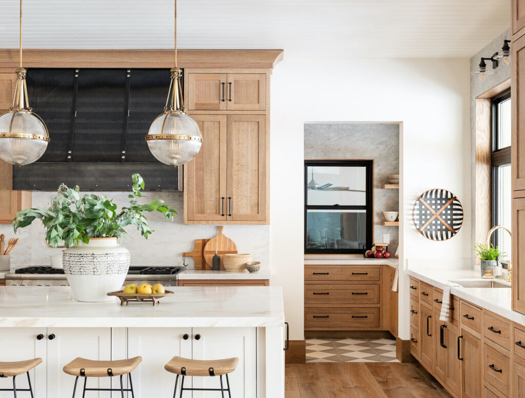
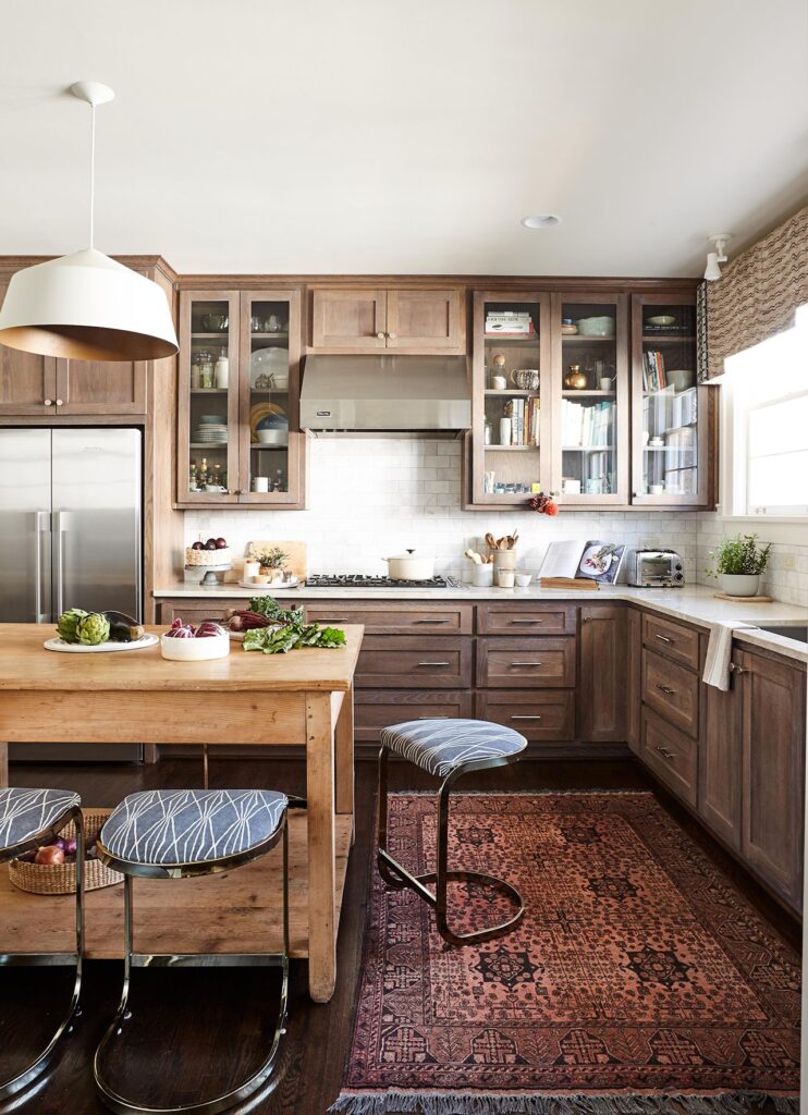
For years, we’ve worked to eliminate the presence of grainy oak kitchen cabinets from the 1980s, and as an affordable solution, we’ve transformed them with paint. Nevertheless, natural and stained wood cabinets are becoming increasingly popular in kitchens, which is understandable; the warmth of wood in a home is hard to resist.


The contemporary style showcases drawer and door fronts that boast clean lines, utilizing reclaimed or sustainable wood, often complemented by open shelving instead of upper cabinets. Some designs embrace a rustic flair, using barn or reclaimed wood for cabinet fronts.


In the discussion about painted versus wood kitchen cabinets, some designers deem all-white kitchens trendy, but I disagree. I think a kitchen featuring white cabinets will consistently evoke a sense of freshness and cleanliness, making it timeless. I have a white-painted kitchen, and I adore every aspect. One cannot dispute the appeal of a classic. White or black paint on cabinets will always look appealing; combining white and wood is another refreshing option.


Wood cabinetry has become a highly sought-after feature in both new and renovated kitchens due to its natural charm. While metal cooktops, hoods, and appliances provide cleanliness and convenience, they can make a kitchen feel less inviting on their own. Combining these sleek metals with warm wood creates a striking contrast and harmony in a contemporary kitchen environment.


Painting my Handrails

June 2, 2022

Painting my Handrails

When I moved into my current home, one of the first things that I tackled was the handrails. I wouldn’t say I didn’t like the stain color at all. It was so outdated. I wanted something that would pop when you came into my home. So I decided to go with a black and white color theme.

This is what it looked like before I went to work. 

It wasn’t easy to paint due to the height. So I had to come up with a way to reach it so I could paint it. Ok, perhaps not the safest way but definitely, the cleverest! Putting the stirs on a 50-gallon storage box!

What a difference. I love the way it came out

Bathroom Tiles in Beautiful Bold Colors

October 28, 2021

There’s been a trend from all-white designs to beautiful bold colors. I”m not saying white doesn’t have its place in the design world, I’m just saying I’ve seen bold colors making a comeback.

There are so many options and colors to choose from. You can go as bold as you like if you’re daring, or just add splashes of it. They have matt finishes to a high gloss. I do love them but truth be told, not sure I would go so bold.

How about you? Would you go bold?!!!


Alternative Bathroom Wainscoting

July 22, 2021

Many of you are very familiar with wainscoting. Most often wood is used. But how about using tiles instead? This opens up many options with style and color. It gives the bathroom a  fresh and creative look. 

Talk about the wow factor. Here are just some ideas!!


Color in the Kitchen!!

November 13, 2020

Color in the kitchen!


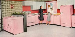
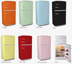
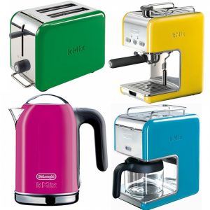
Color in the kitchen? Why, yes, please. Today’s kitchen has a lot more color than it has in the past few years. Do you remember the 50’s when colored appliances were all the rage? Since then, color in the kitchen has all but phased out. But I’m starting to see the return of color in the kitchen, and I love it.


Don’t want to invest in a major (color appliance) purchase? Afraid it may be outdated in a few years? Then how about using smaller appliances?


There is so much to choose from. Anyone of these appliances can add so much color to your kitchen without a considerable commitment. Are you tired of the color? Switch it out to another color. It will indeed be expensive to switch out your coffee pot, toaster, or blender, but it’s a lot less than switching out your stove.


At Abella Home Staging & Redesign, we believe any home can be beautifully transformed. We believe in delivering a custom-made look but without the custom-made price tag!! Call us, and let’s get started today!!

Image Via Pinterest
#AbellaHomeStaging