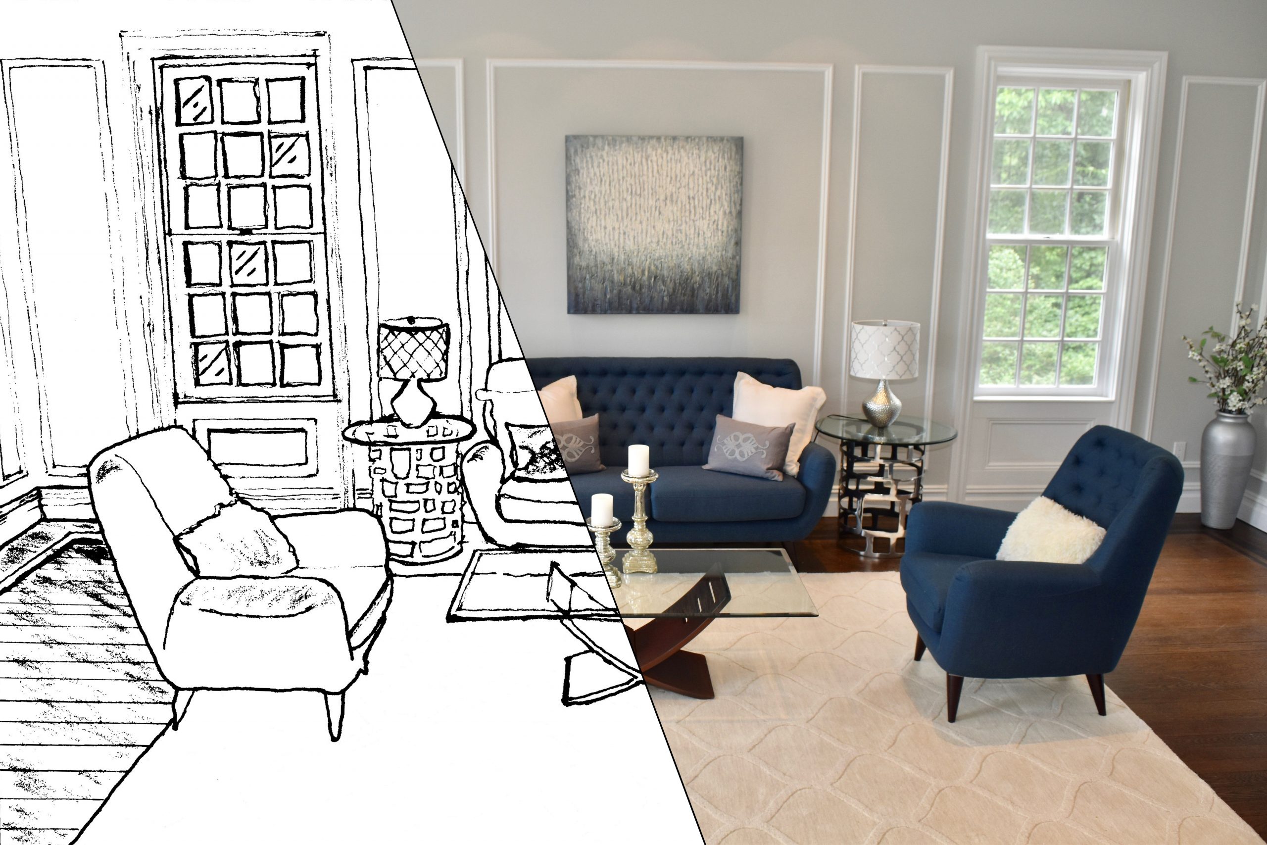
Why is so difficult to choose paint color?

September 19, 2019

Why is it so difficult to choose paint colors???

Why is it so difficult to choose a paint colorMore enough then not, I hear my clients say,“I thought this was the perfect color until I saw it on the wall”. So many times, the homeowners will choose a color they saw in a magazineThe problem with that, you don’t have the same accessories or furniture as the magazine picture. It may not work. Other times they have a color in mind, but they picked the wrong undertone. That is probably the biggest mistake I see.

Here are some guidelines to help your process.
  • Every color has an undertone. Meaning all beiges started as a color, whether it’s yellow, red, green, or orange. So pay attention.

Yellow undertones


Green undertones

  • Determine what undertones are in your room like your carpet, flooring, furniture, or accessories.
  • Keep all your neutral the same undertones. By doing this, you are assured of having a successful color palette.
  • Don’t forget about lighting. All colors will look different in different lighting situtaions, morning sun, afternoon shade, and evening lighting. So make sure you test the colors in these situations.
  • Use large paint samples. Many companies, like Sherwin Williams, offer 8×11 samples that can be ordered online. This is great because you can truly see the color.

  • NEVER paint the color sample directly on the wall. The existing color will influence the color sample, and you not get an accurate read!!

These guidelines will help you when choosing your color palette . You can also decide to hire a Designer. This small investmentwill assure you that the colors you are choosing are the correct one. You are thereby eliminating any costly mistakes. So well worththe cost. 

All Images Via Pinterest
#AbellaHomeStaging


Color has meaning and emotions!

July 11, 2019

Did you know that color has meaning and emotions? No? Well, they do!! Many companies will spend thousands of dollars on a color specialist to get the right color for their products or office/building. That’s how important color is!

thought it would be fun to give you some insight behind each color.

  • Red. An intense color that can pump the adrenaline and increase your appetite. That’s traditional red was commonly used in dining rooms. Brick reds are much more classic, warm, and have an earthier feel. Cherry red, think energy and romance! Whichever color red you choose, red commands attention. Did you know that the reason surgeons wear blue scrubs is to give their eyes rest while working on the inside of the human body?!!
     
  • Orange. Enthusiasm, creativity, and warmth! It’s also the one color that is most often used in fast food advertising!!

  • Yellow. Sunny, bright, and welcoming. Yellow will lighten your mood and lifts the spirits. Although yellow is a happy color, intense yellow can be difficult on the eyes. It’s that very reason that you should avoid using intense yellow in a young child’s room. Soft yellow, howeveris easy to live with and can coordinate with every color.

  • Green. Think nature. Can also be restful, balancing, tranquil and invigorating. Most medical facilities will use green to comfort patients. In the entertaining world, many people will wait in a “green” room before a performance. Dark green has a more conservative, traditional feel, while light green has a more natural and soothing earth tone feel to them. Green will work well with almost every color.

  • Blue. Calm, meditative, and clear thinking (surgeon’s scrubs). Blue also invokes clarity, honesty, and loyalty. Blue is the color most often used in bedrooms.

  • Purple. Luxury, wealth, romance, royalty, and sophistication. Purple is often associated with being magical and mysterious. Purple was heavily used during the Victorian age due to its quiet elegance and formal look. Lighter purples convey femininity, splendor, and even romance! Light purples are great in children’s bedroom!!

  • White. Think purity and freshness.

  • Black. Elegance, power, and strength.

  • Brown. Comfort (earth), stability, and security!

As a designer, I have seen first hand what the wrong color can do to a room! If you choose the wrong color, then everything else that follows, will not work. Color is the building block of good design.  If you’re not sure about the color, consider hiring a designer. This way, you’re guaranteed your design will work.