

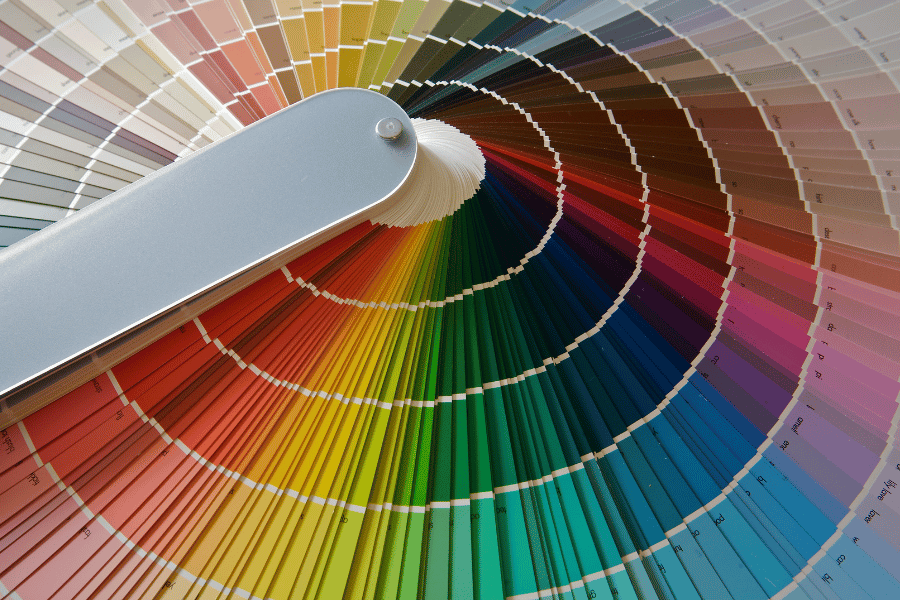
Color Meaning And Emotions
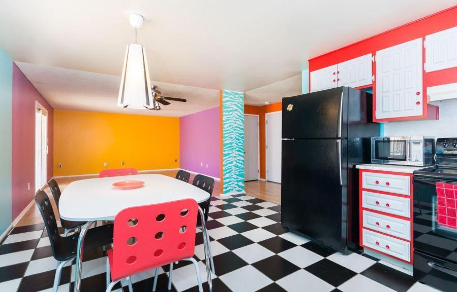
Red pumps the adrenaline like no other color, and it’s no wonder it stimulates the appetite…can anyone say red dining room? Red is so intense and tiring for the eyes that surgeons wear baby blue scrubs as an eye respite while working on the inside of the human body, which is blood red. Deep reds have a traditional feeling of importance and stature, and bright reds impart adventure. Brick red has an earthier feel and provides a classic, warm, understated look, while cherry red symbolize romance and energy. Either way, red will attract the most attention, so red is an excellent distracter in staging!

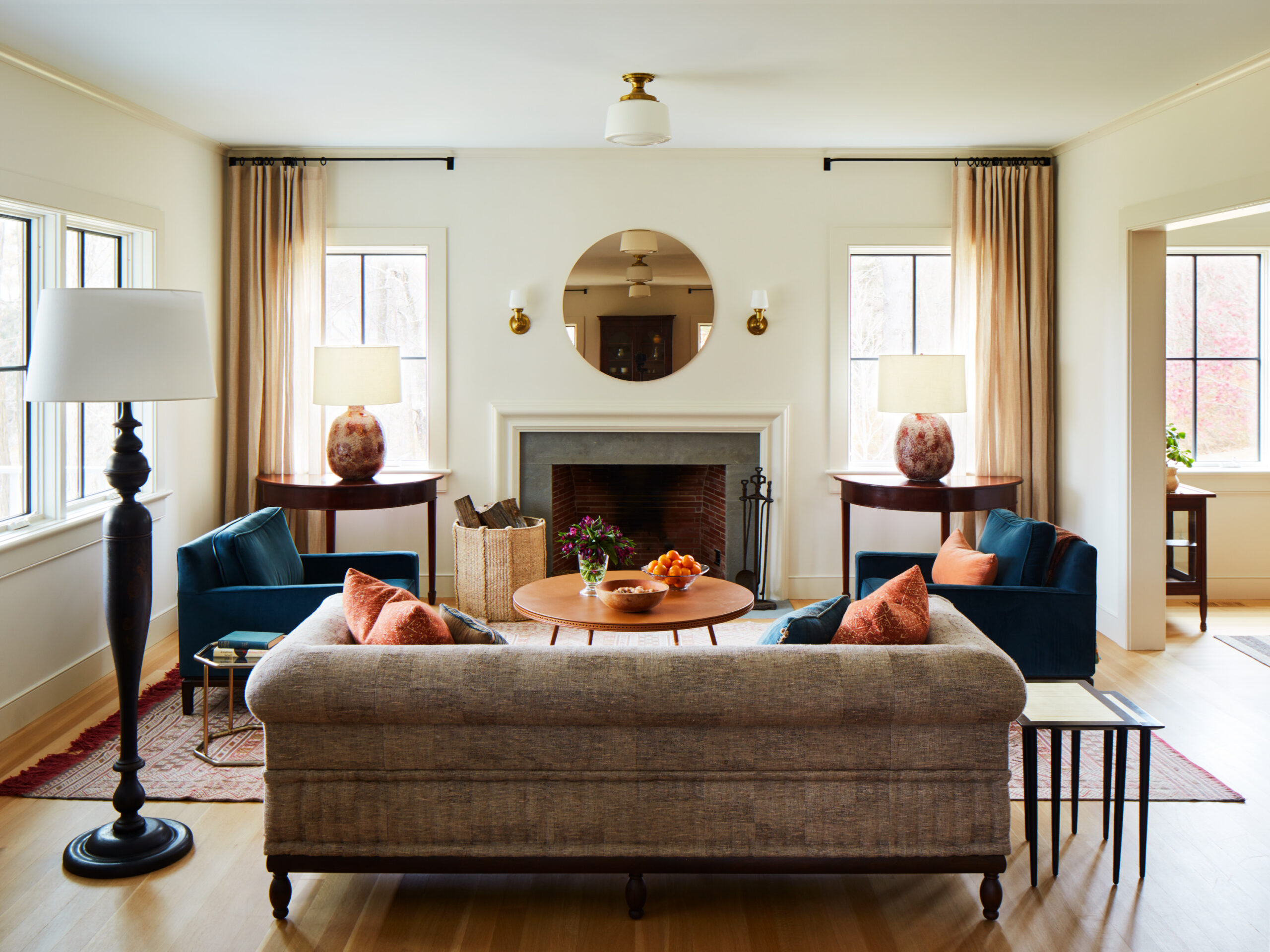
Orange is the color of enthusiasm, creativity, and warmth. It conjures up images of fast food and advertising. Orange can range from bright yellow oranges to deep terra-cotta and rust. Few use orange “as is” in large quantities, but orange is the source of many more workable hues. Rich oranges can be copper or paprika, which remarkably share the warmth of an earth tone and can be comforting and warm. Pale peach has a lovely, light accent.

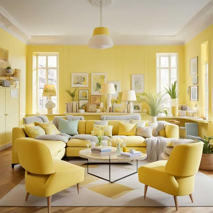
Yellow is welcoming, sunny, bright, and enthusiastic. There’s nothing like yellow to lift the spirits and lighten the mood: bold yellows and formal gold demand equally intense color companions like royal blue and crimson red. Bright yellows have a vibrating intensity that can be difficult on the eyes and are not suggested in young children’s rooms. Soft yellows with names like wheat, maize, and taffy are ideally suited to walls and furnishings where stronger colors might overwhelm them. Coordinating with almost any other color, soft yellows are easy to live with.
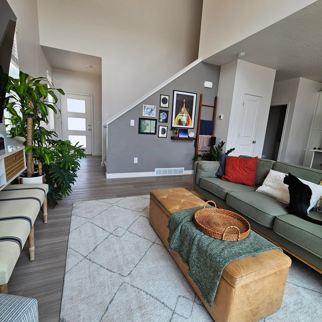
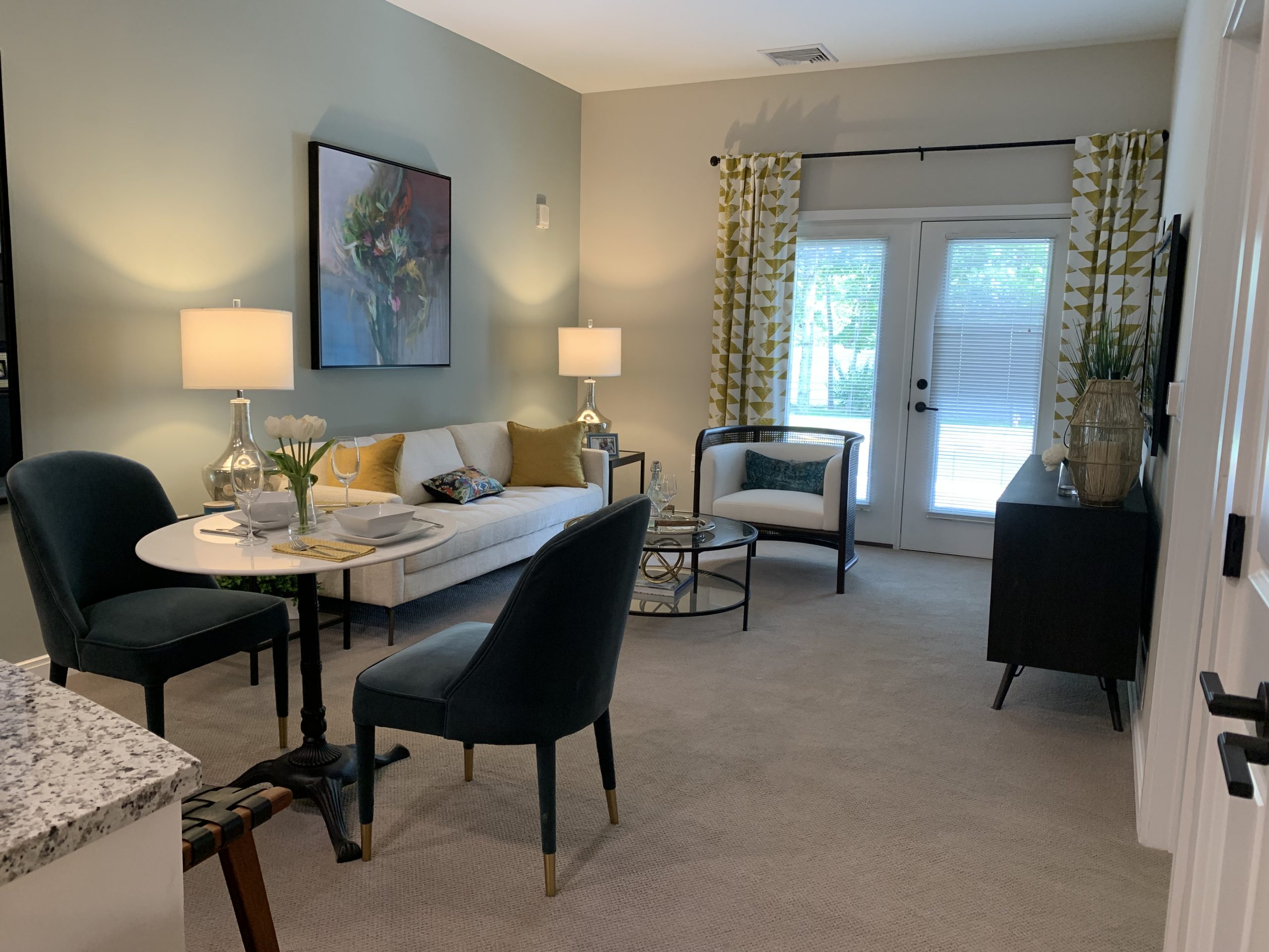
Green represents nature and can be tranquil, invigorating, restful, and balancing. It is relaxing and soothing, so it is used in places where people are comforted, whether it is a medical facility or a “green room” where people relax before a performance. Dark greens inspire a more conservative, traditional environment. Lighter, soft greens recall nature and soothing earth tones and look at home in almost any scheme, especially one that includes warm wood. Green is considered the fourth primary as it works well with almost any color.
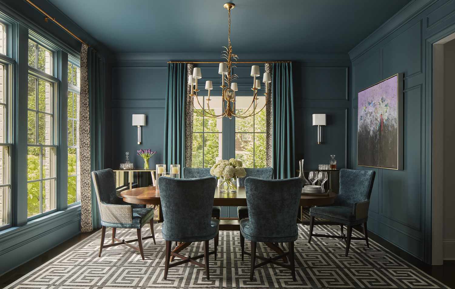
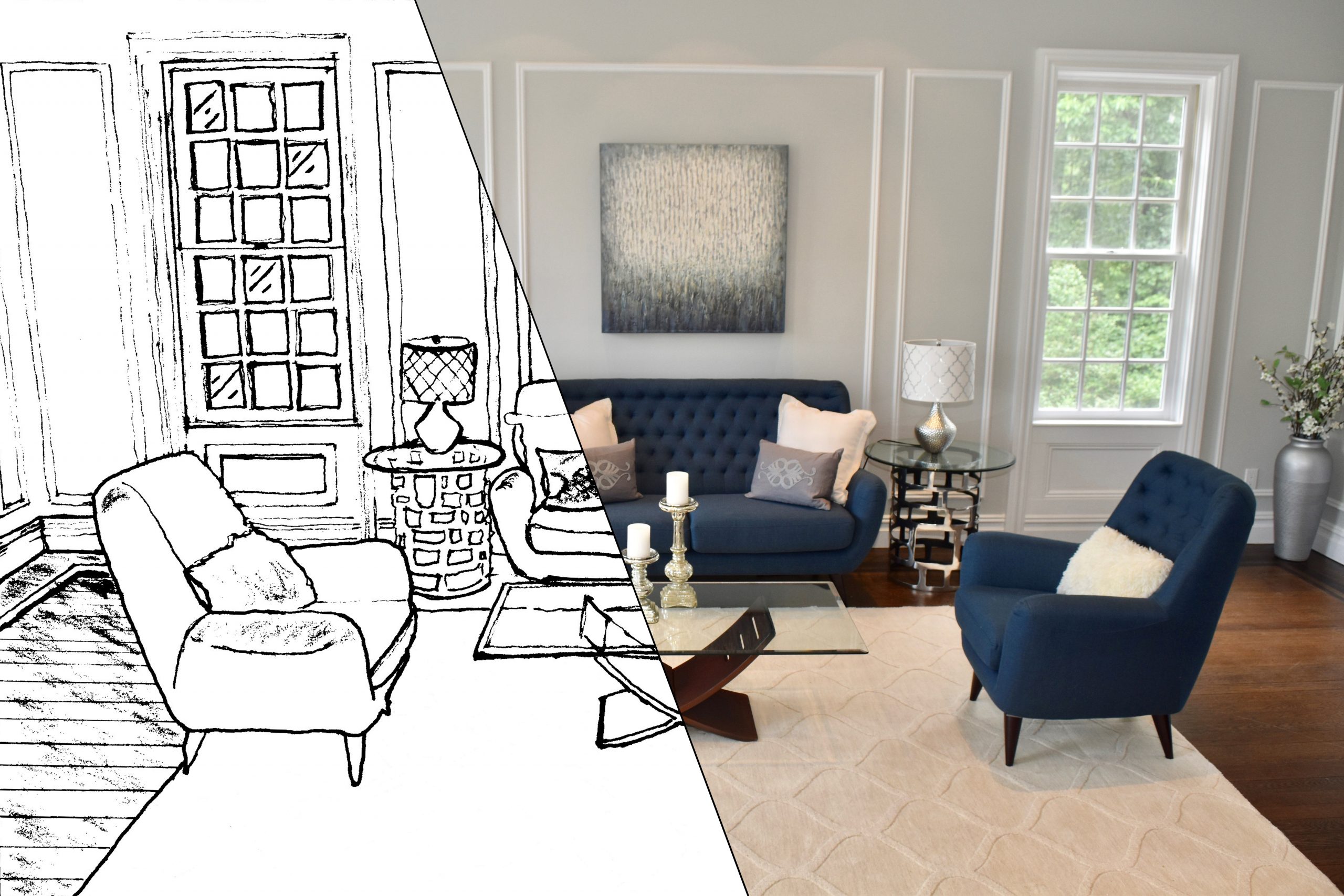
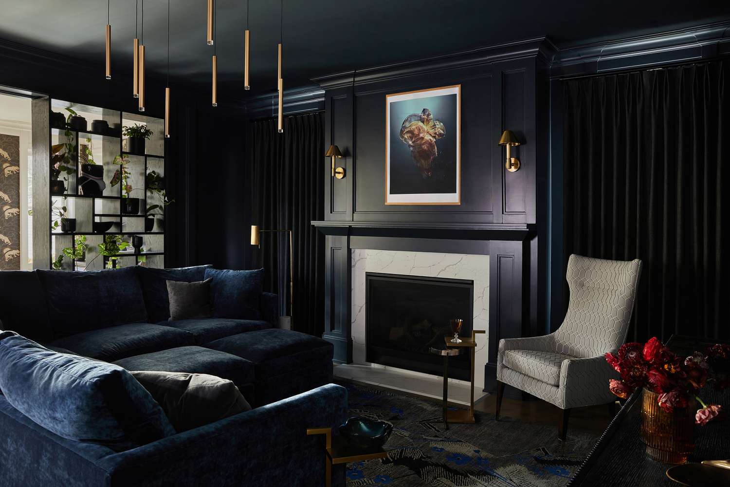
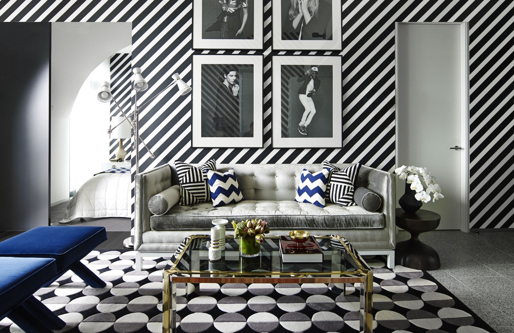
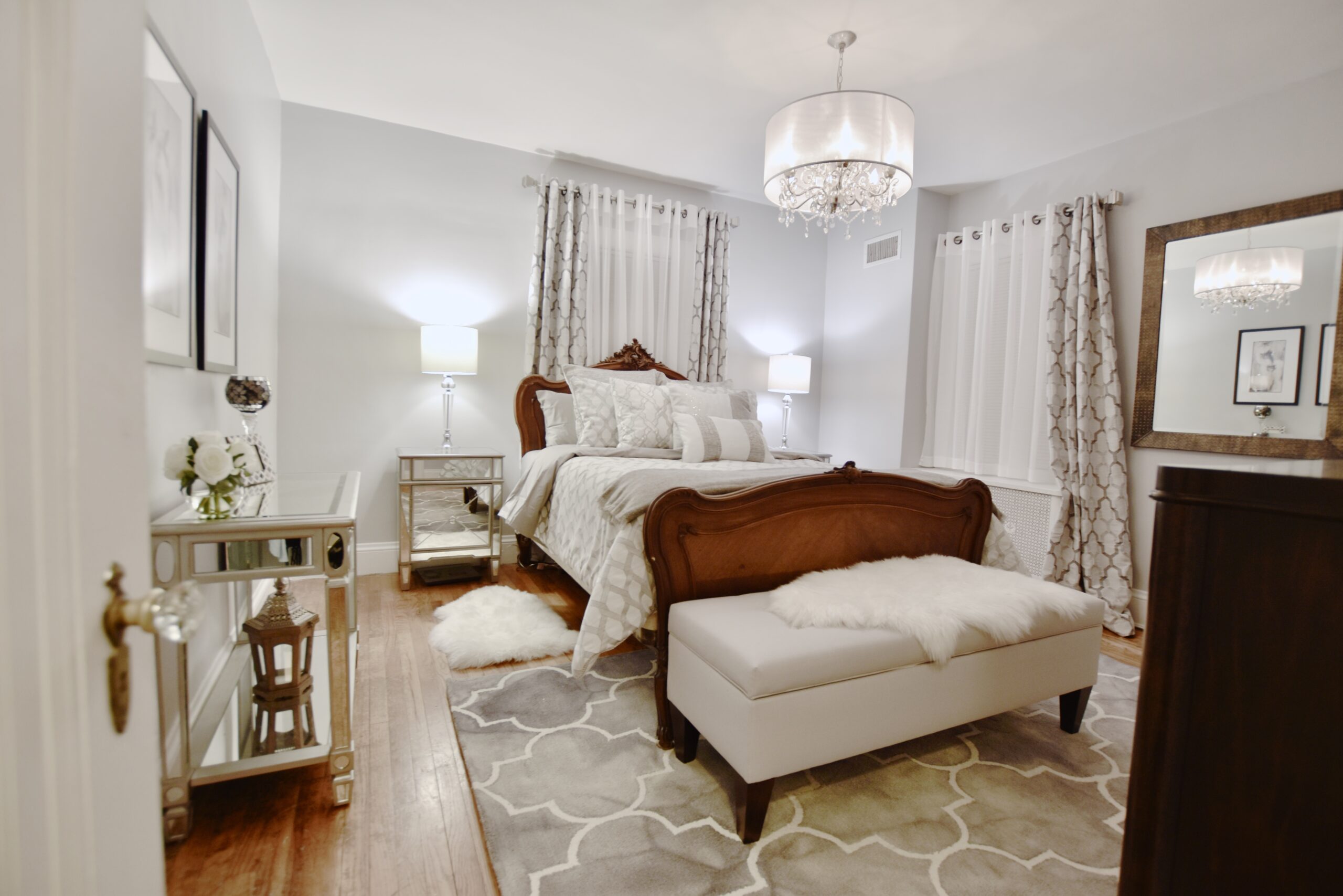
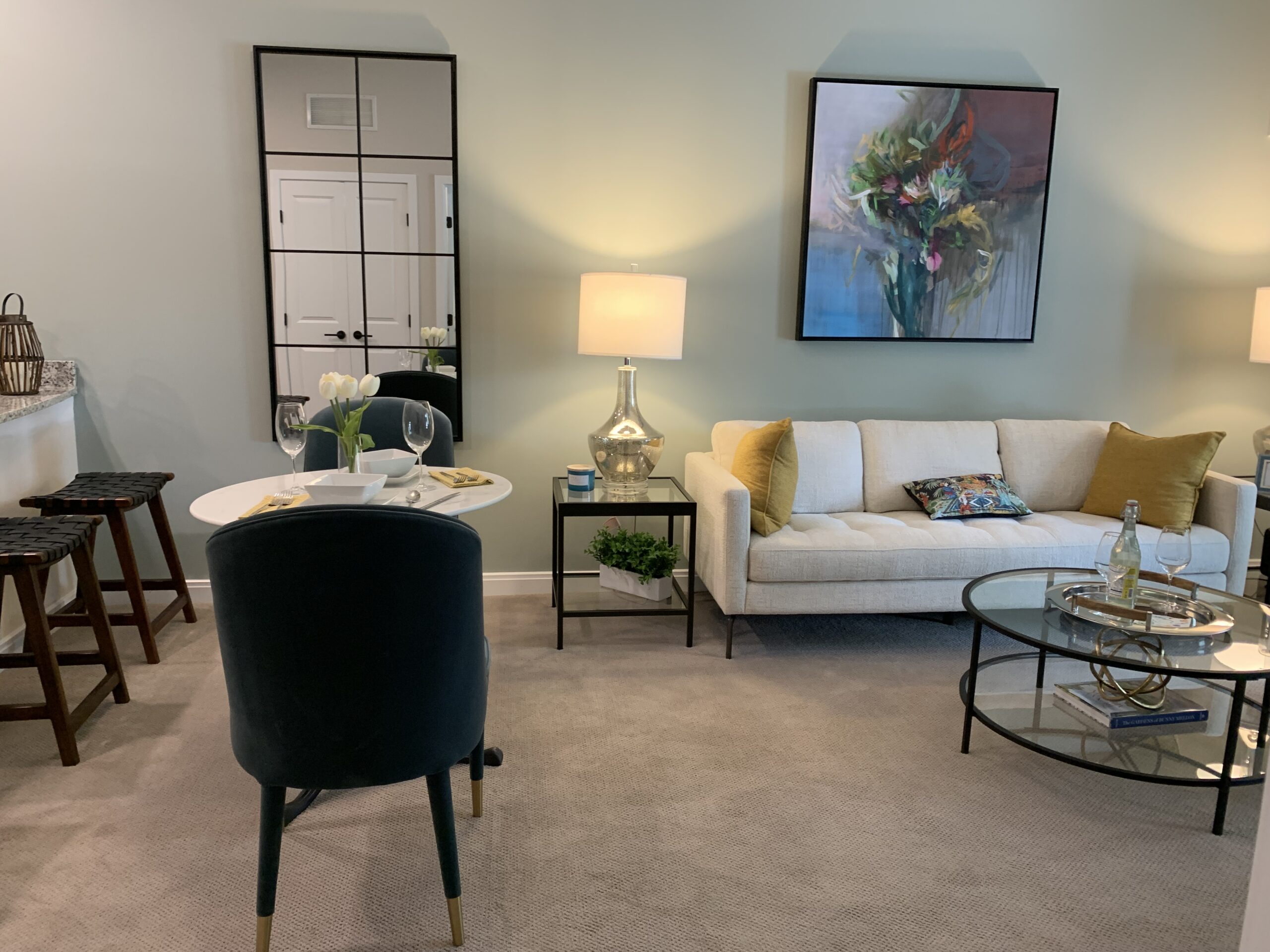
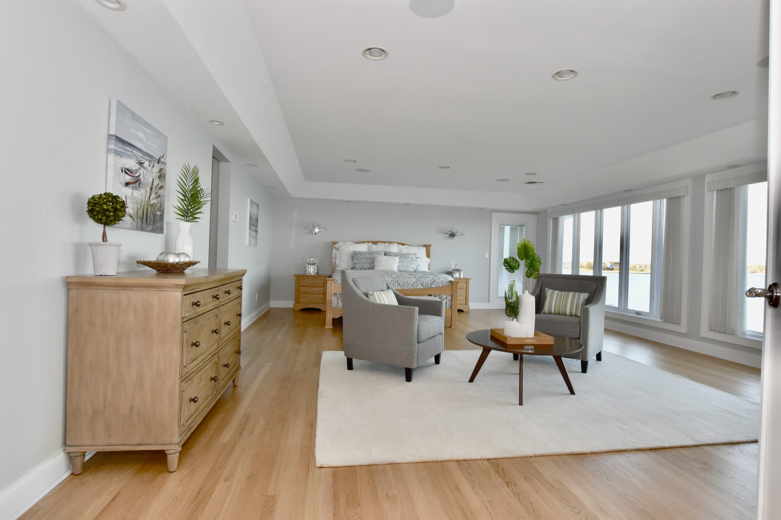
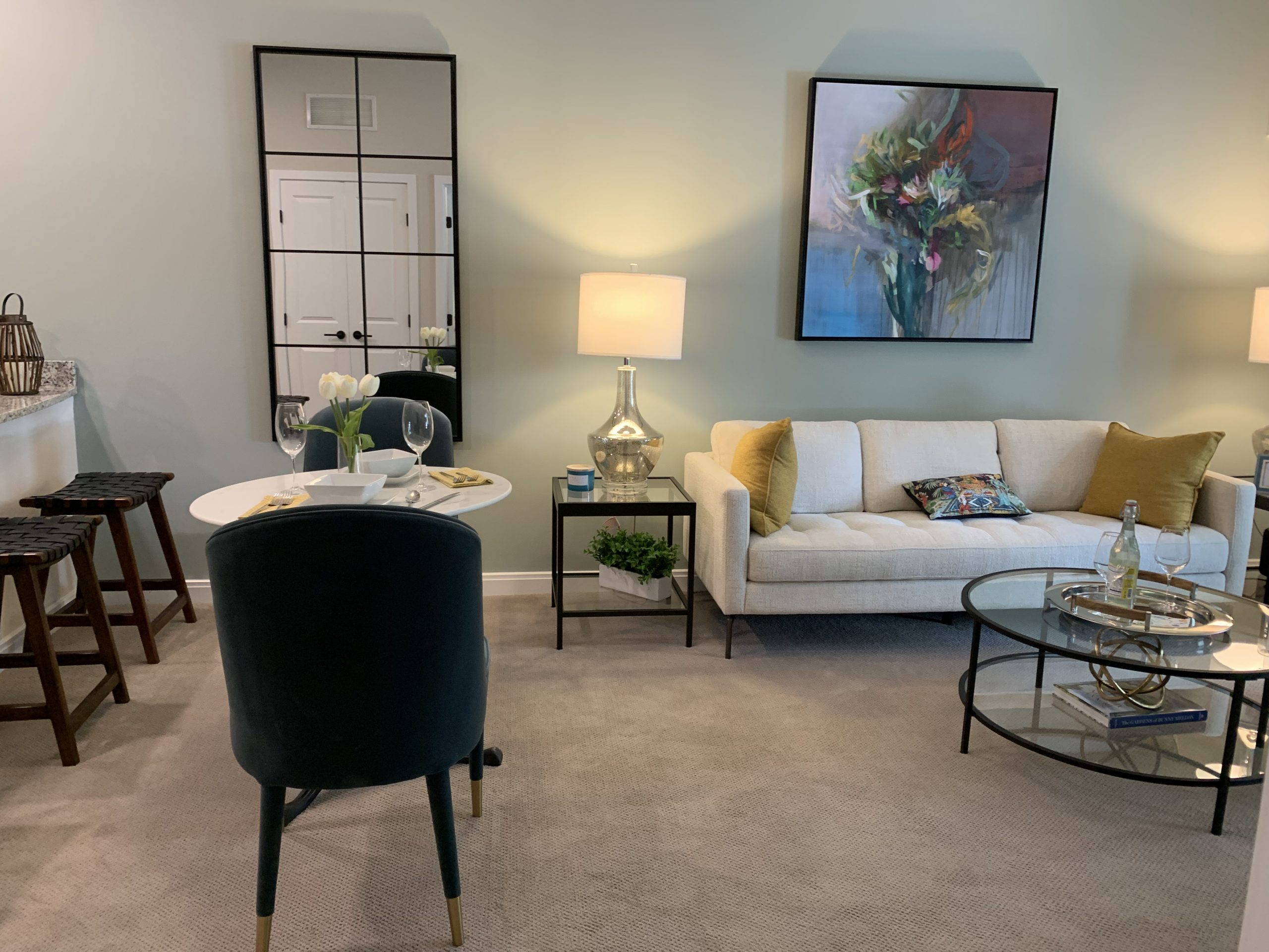
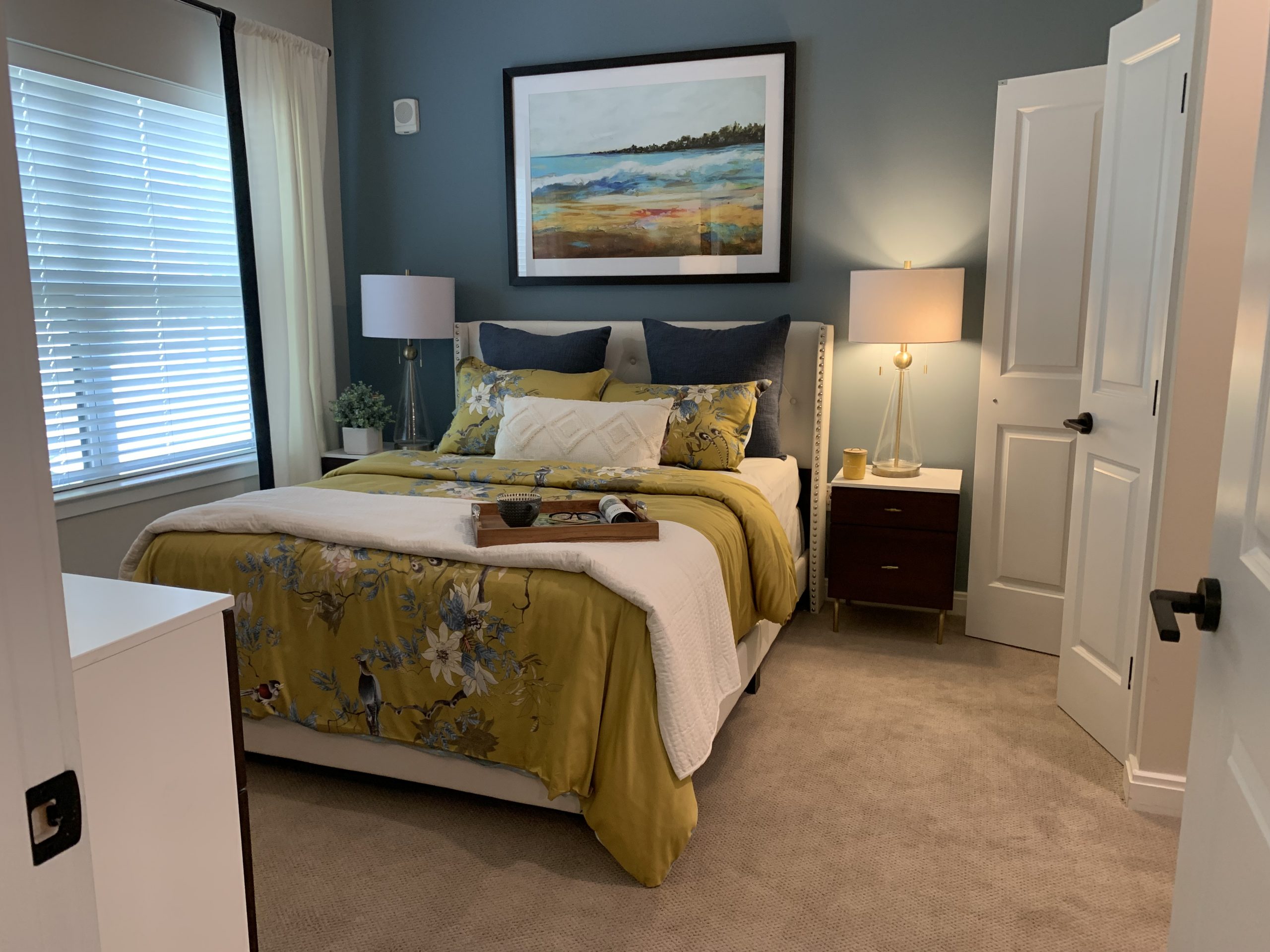
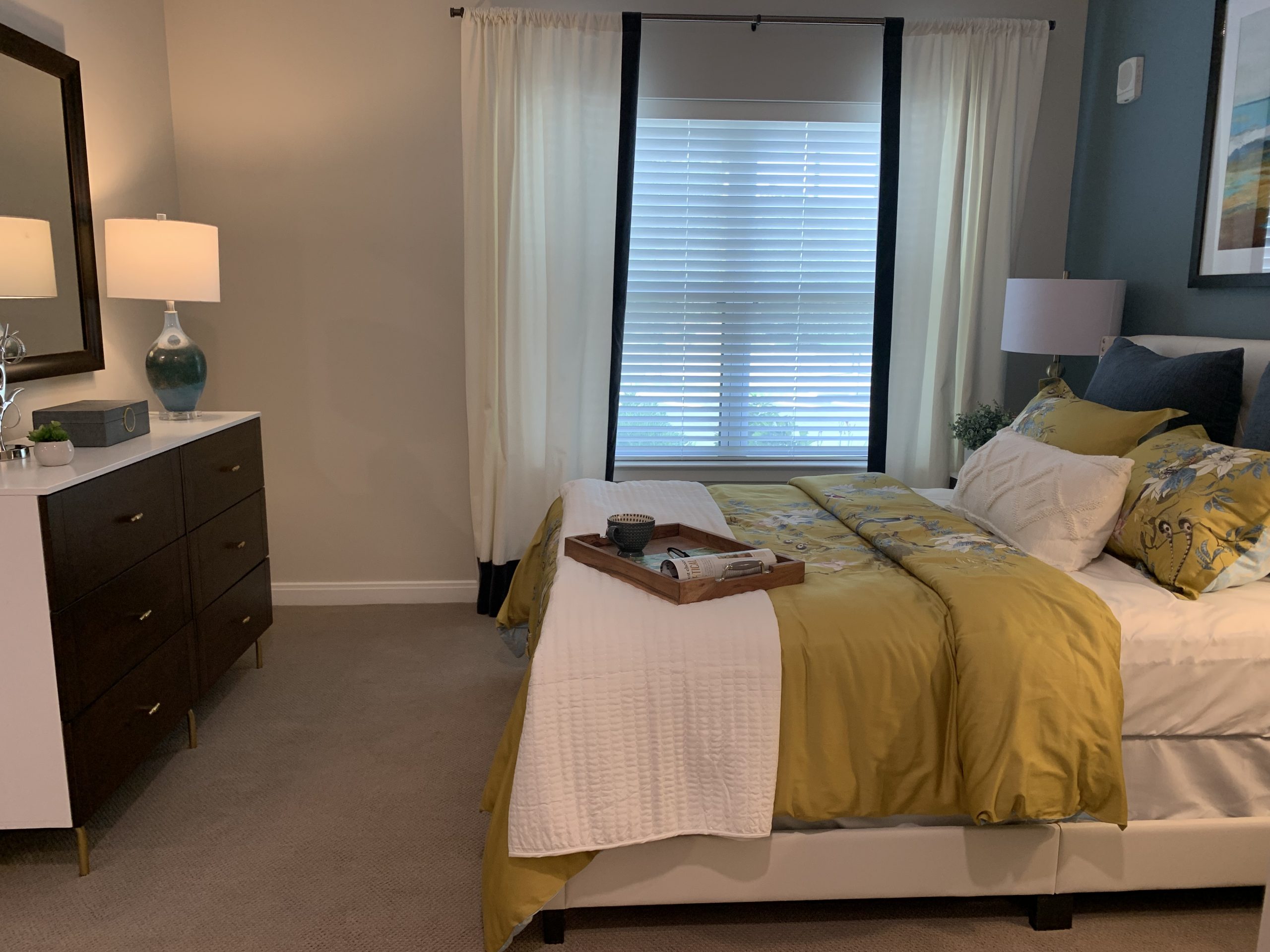
Blues are connected to both sky and water. They are associated with clear thinking and calm, meditative environments (think surgeon’s blue scrubs). Blue also invokes the qualities of loyalty, honesty, and clarity. Blue is a relatively broad color family, including hues as varied as cornflower, cobalt, and cerulean. Bright, breezy blues please children, while less intense versions satisfy more sophisticated tastes. Blue is the coolest color on the wheel, generally producing tranquil feelings and peaceful moods. It is my favorite bedroom color!
Purple brings luxury, wealth, sophistication, mystery, romance, and royalty to mind. This mix of emotions is common as some people view it as magical and mysterious, while others as dark and dreary associated with the Victorian era. Rich purples can be used in rooms of quiet elegance and convey a formal look combined with cream, gray, and black. Soft purples like lilac and lavender can be more feminine and create a feeling of splendor, style, and light-hearted romance. The light hues go particularly well in bedrooms or children’s rooms where the mood is cooling, romantic, or whimsical.

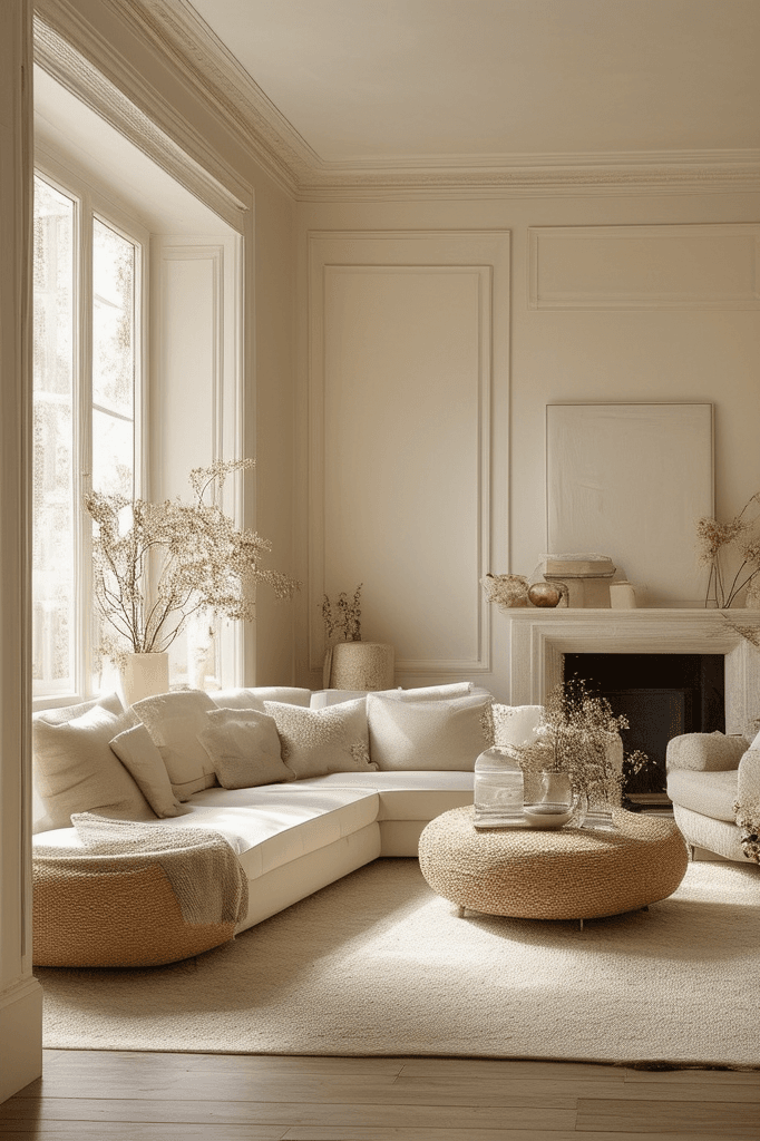
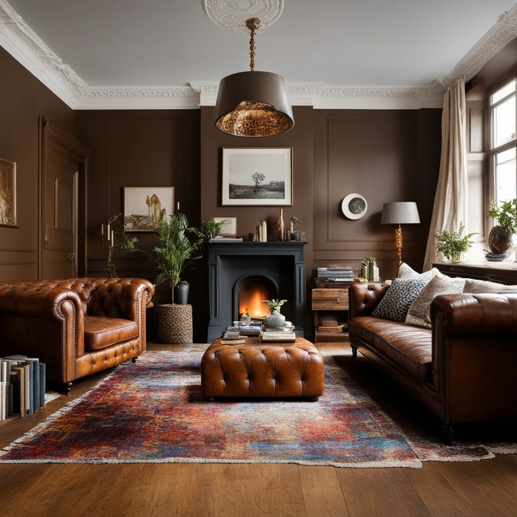
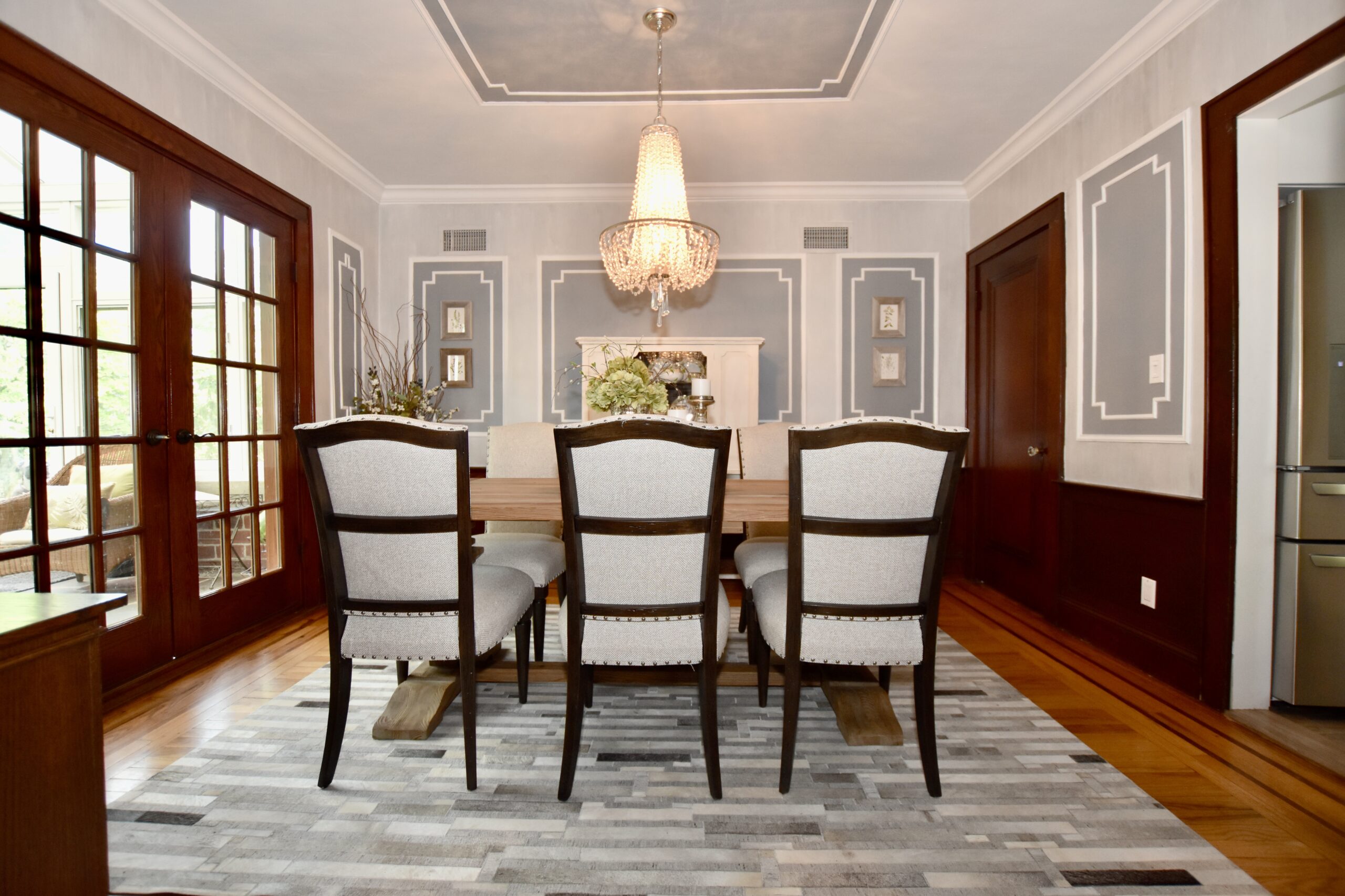
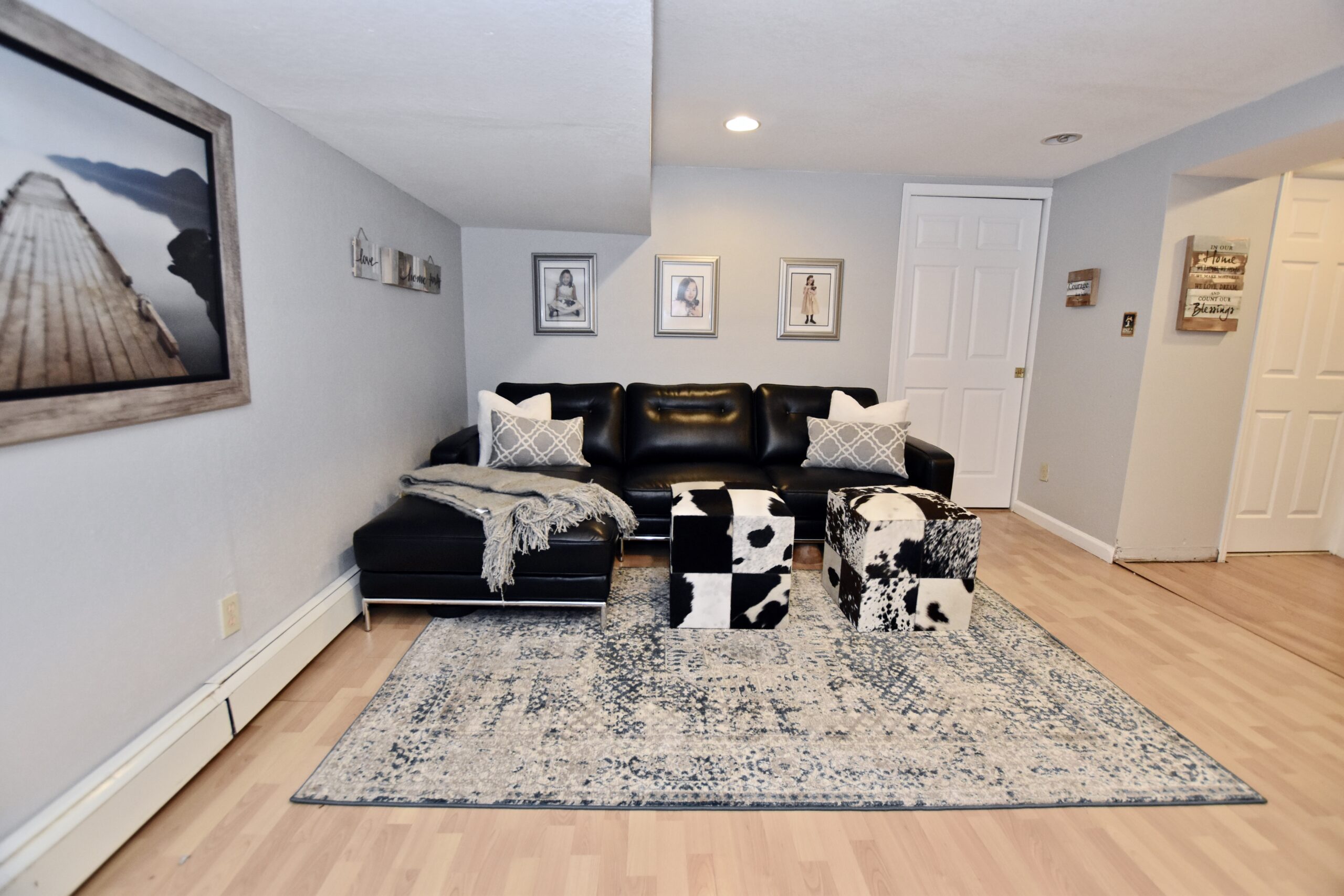
Neutral colors like white (purity and freshness), black (understated elegance, power, and strength), and brown (stability, security, and comfort) work wonders in any color scheme.


