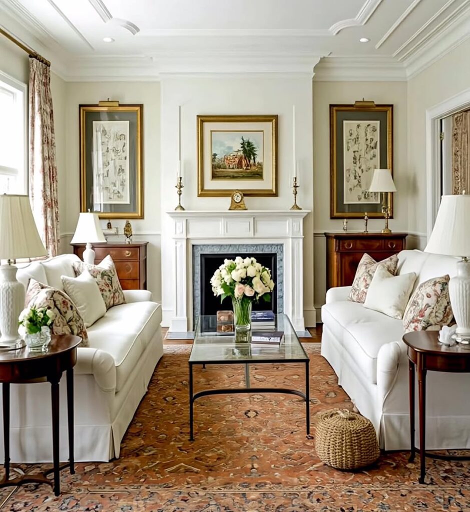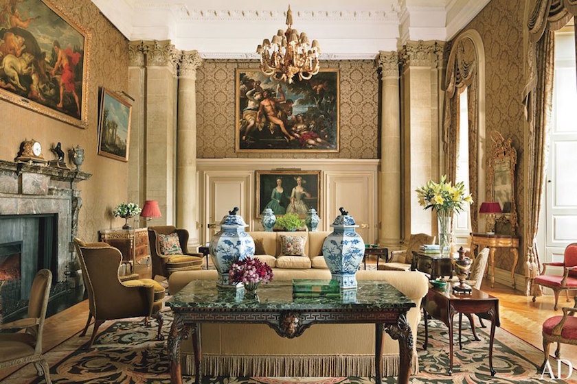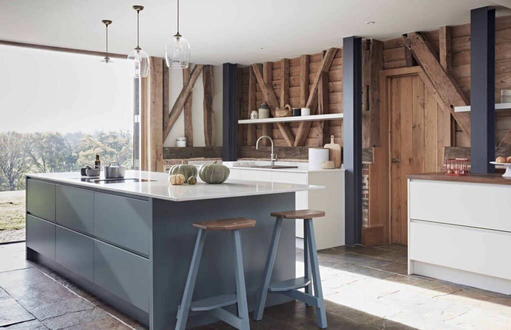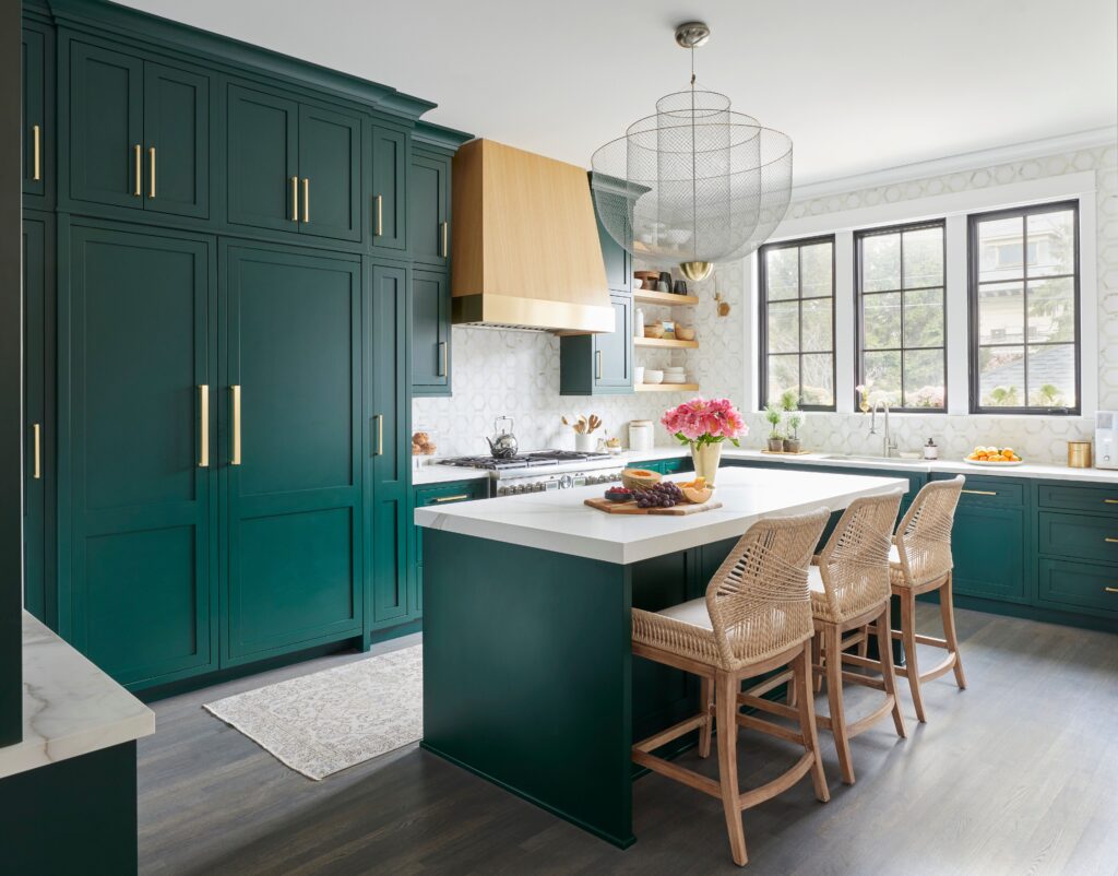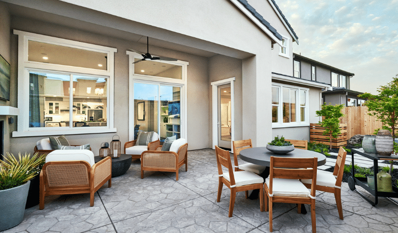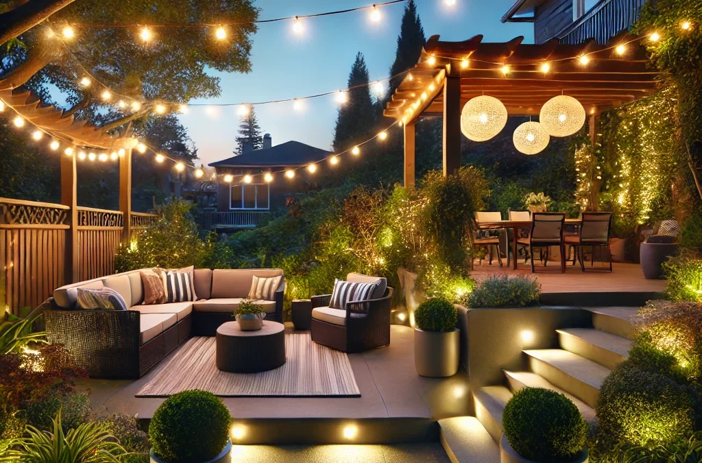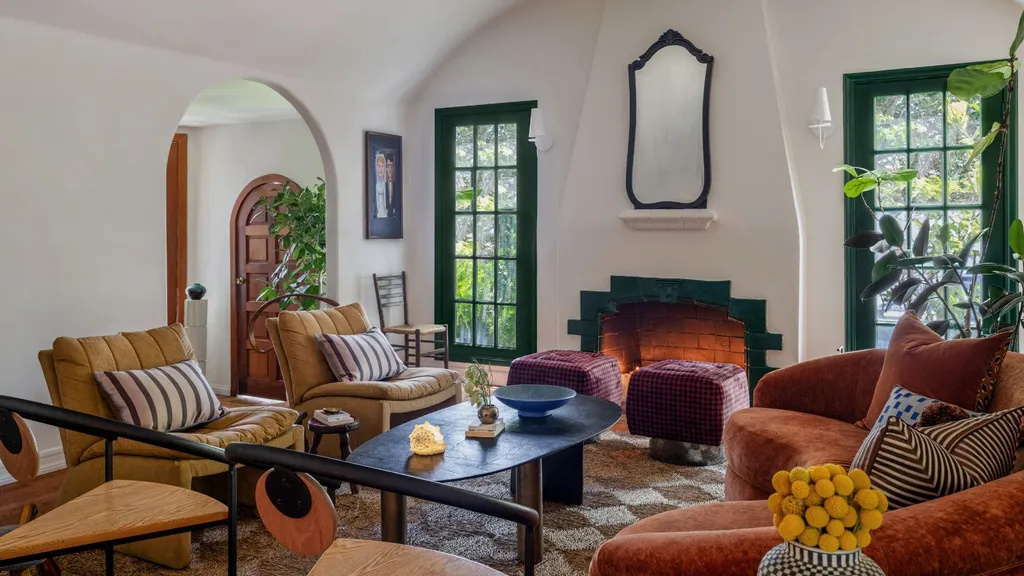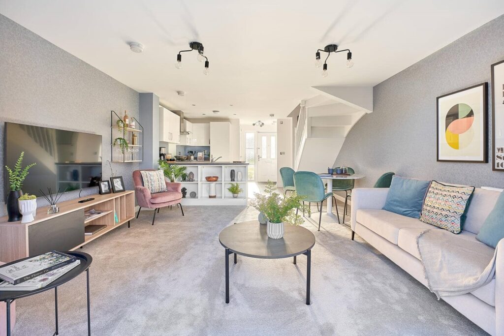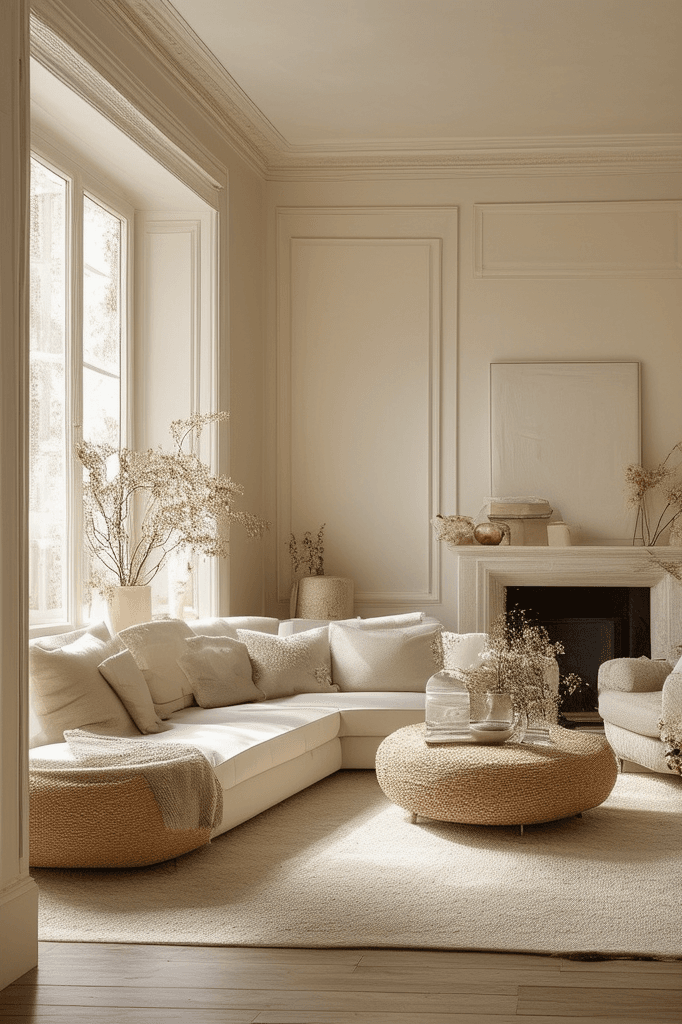

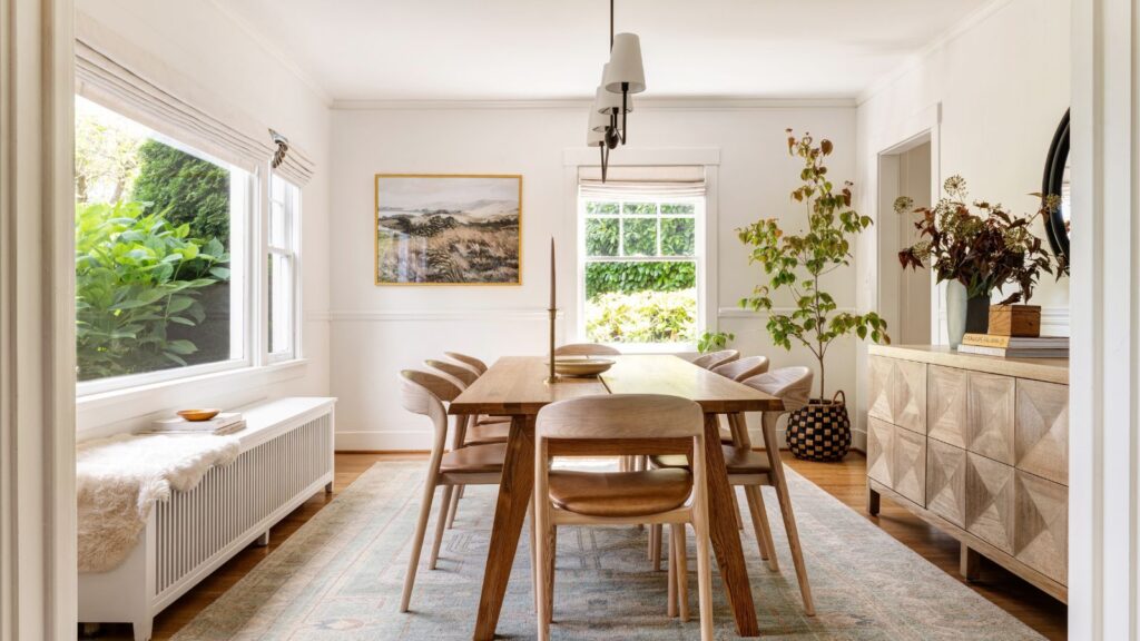
Trends may come and go, but neutral color palettes remain a constant in interior design. From soft whites and warm beiges to gentle grays and earthy taupes, neutral tones have proven time and again that simplicity never goes out of style.
A Foundation That Lasts
Neutral colors create a versatile backdrop that adapts effortlessly to changing trends. While bold hues may feel exciting in the moment, they can quickly become dated. Neutrals, on the other hand, provide a steady foundation that allows furniture, artwork, and décor to evolve without requiring a complete redesign.
Light, Airy, and Inviting
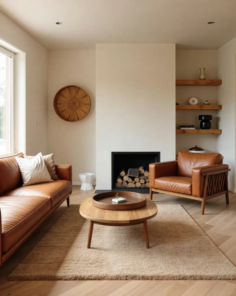
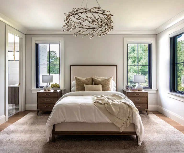
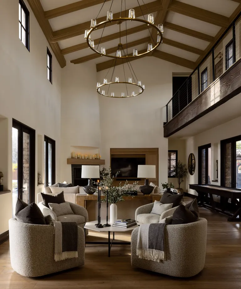
One of the biggest advantages of a neutral palette is its ability to make spaces feel open and calm. Lighter tones reflect natural light, making rooms appear larger and more inviting. The result is an atmosphere that feels both sophisticated and comfortable.
Easy to Layer and Personalize
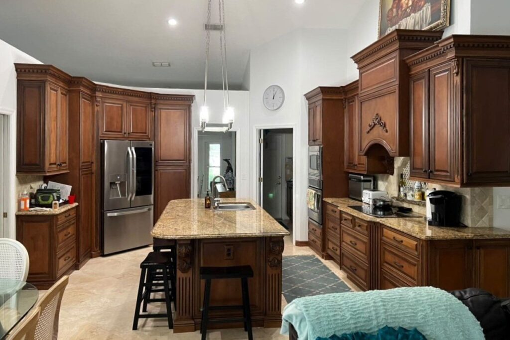
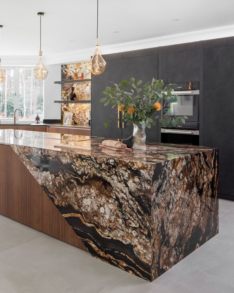
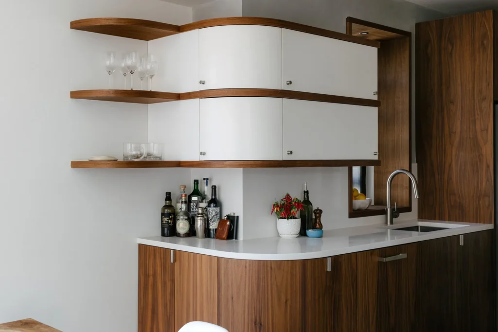
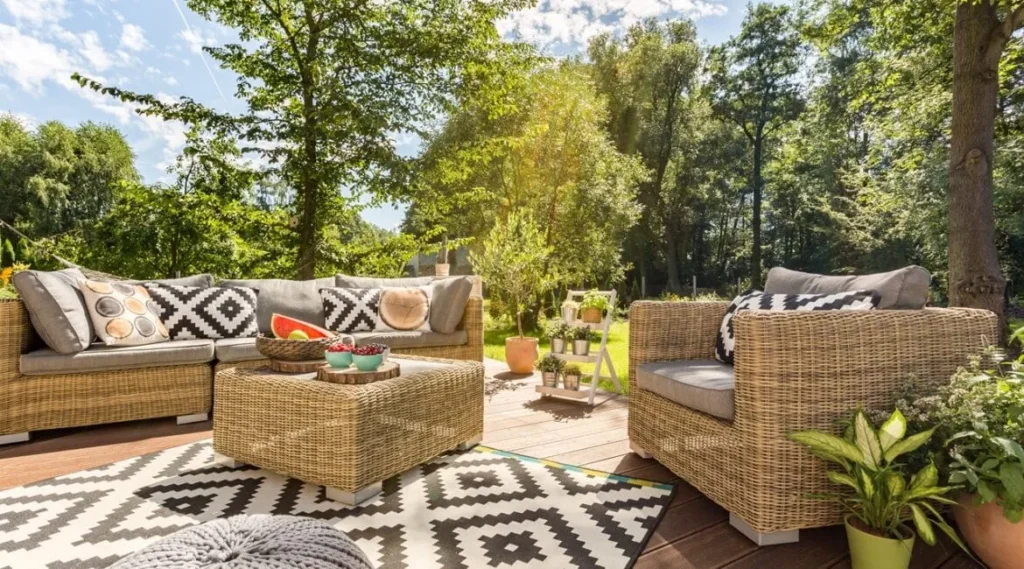
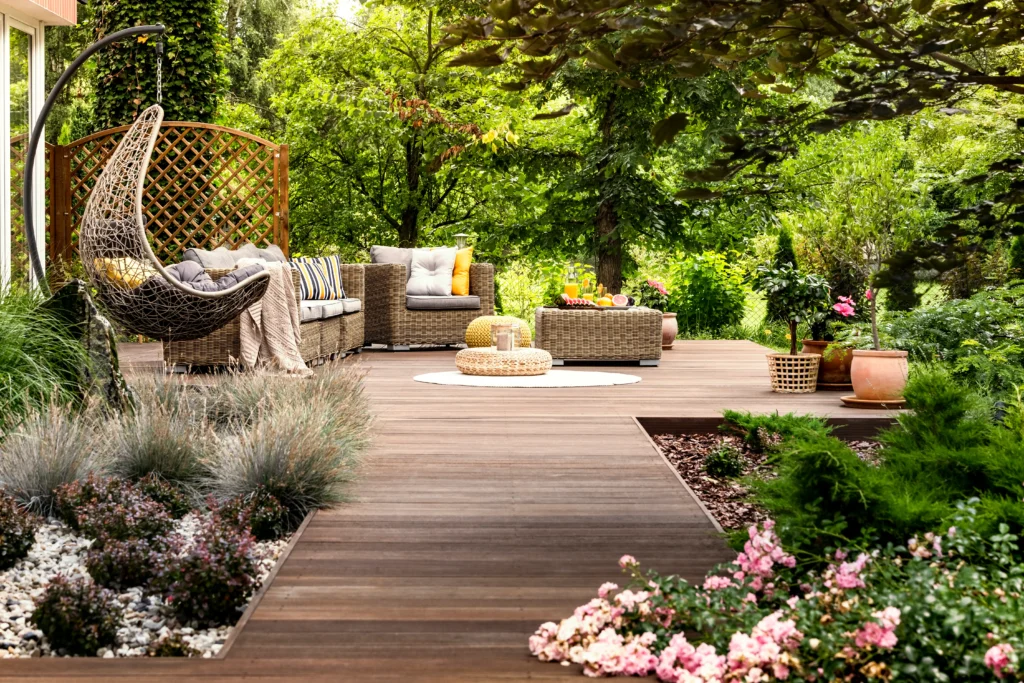
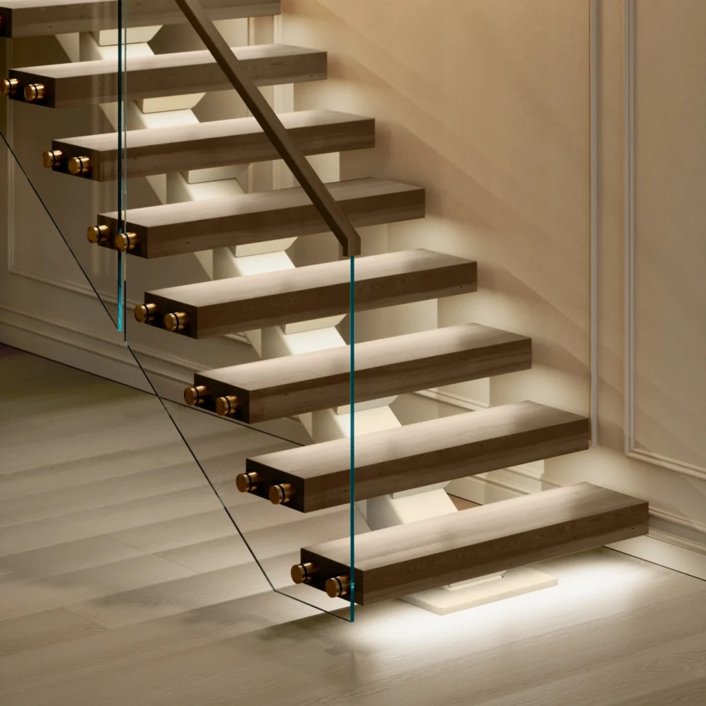
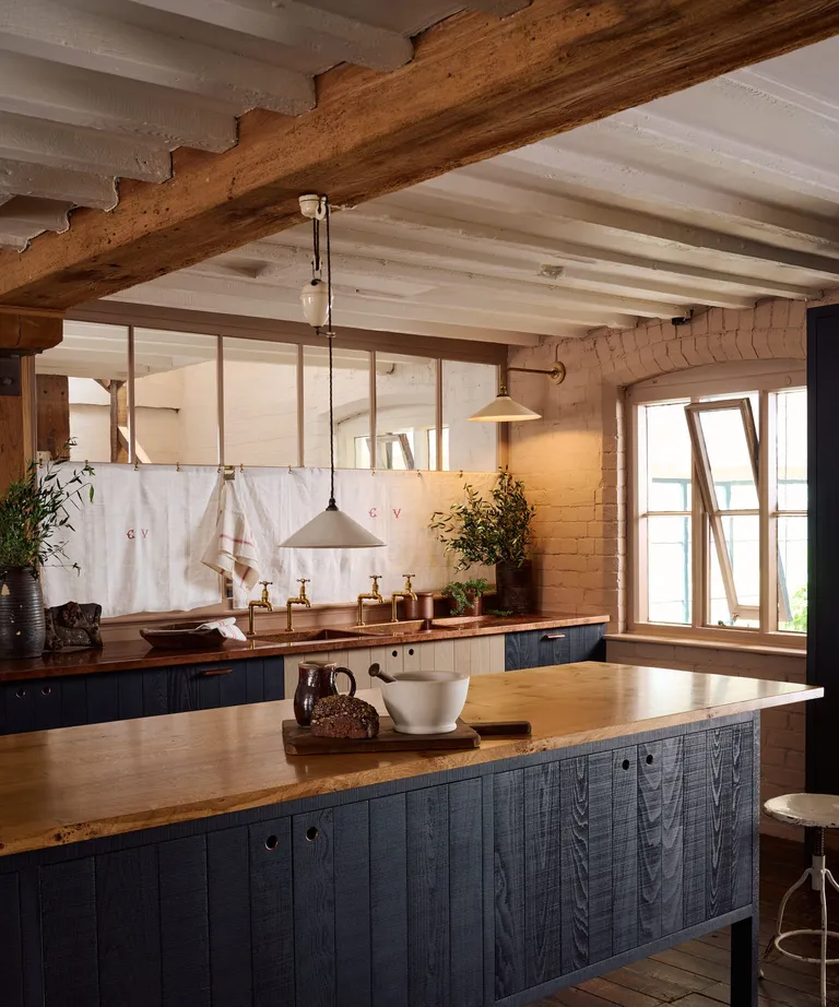
A neutral interior is far from boring. Texture becomes the star — think linen fabrics, natural wood, woven rugs, stone surfaces, and soft textiles. Layering different materials and subtle tonal variations adds depth and interest while maintaining cohesion.
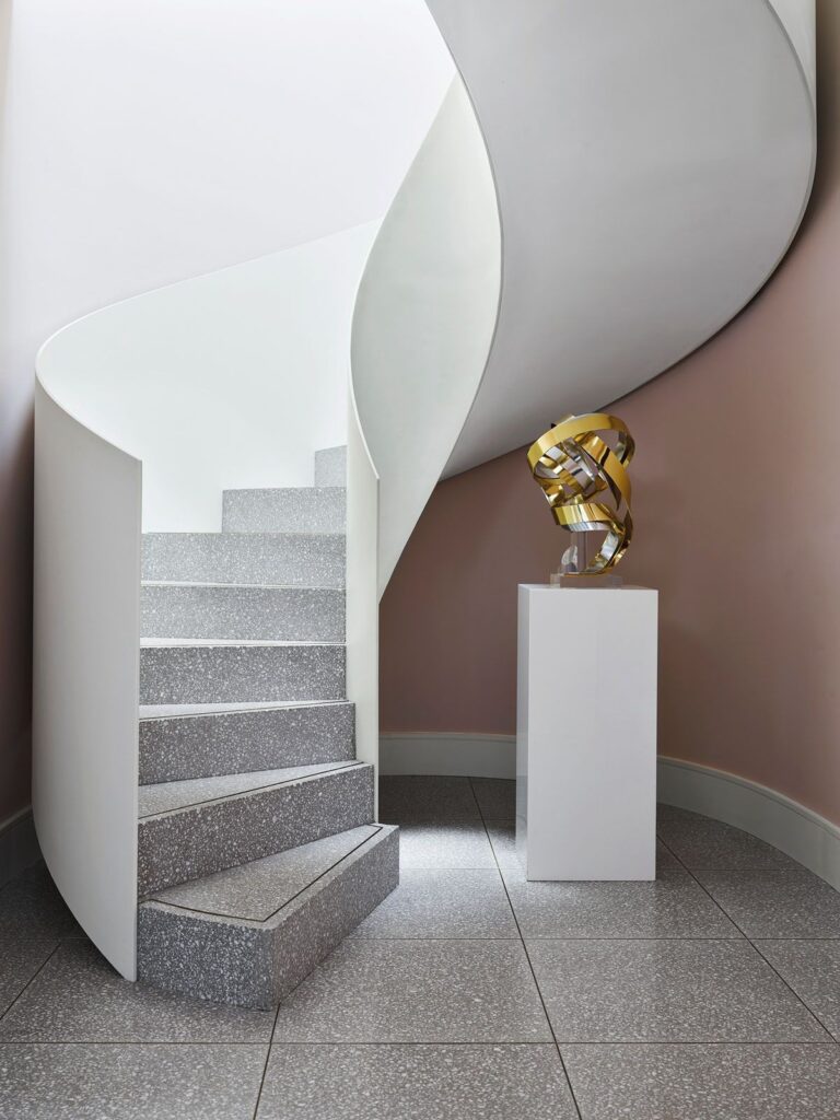
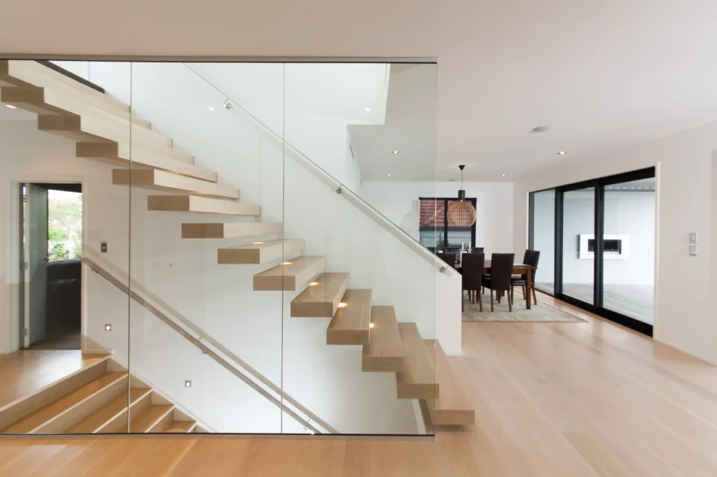
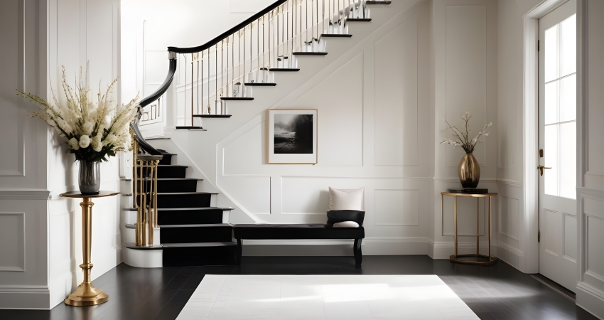
Enhances Architectural Features
Without competing colors, architectural details such as moldings, beams, fireplaces, or statement lighting stand out more clearly. Neutrals allow the space itself to take center stage.
A Smart Long-Term Investment
Whether you plan to stay in your home for years or eventually sell, neutral interiors appeal to a wide range of tastes. They feel clean, polished, and universally welcoming — making them a safe and enduring design choice.