2026 Interior Dsign Color Trends

February 26, 2026

Interior color trends for 2026 are all about comfort, depth, and personality. Cool grays are officially out, making way for palettes inspired by nature, warmth, and emotional well-being. Homes are becoming more personal—and color is leading the shift.

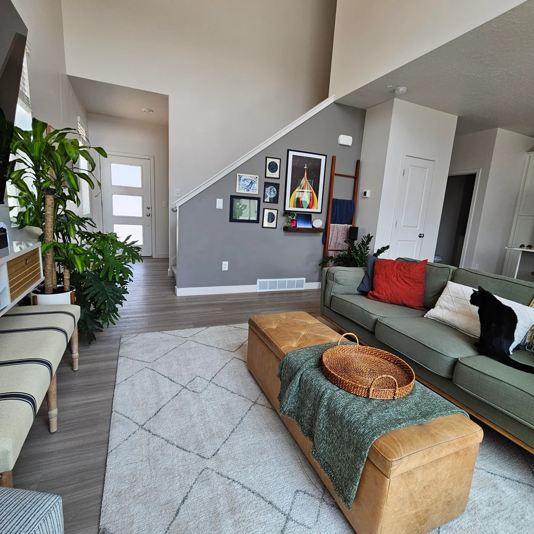
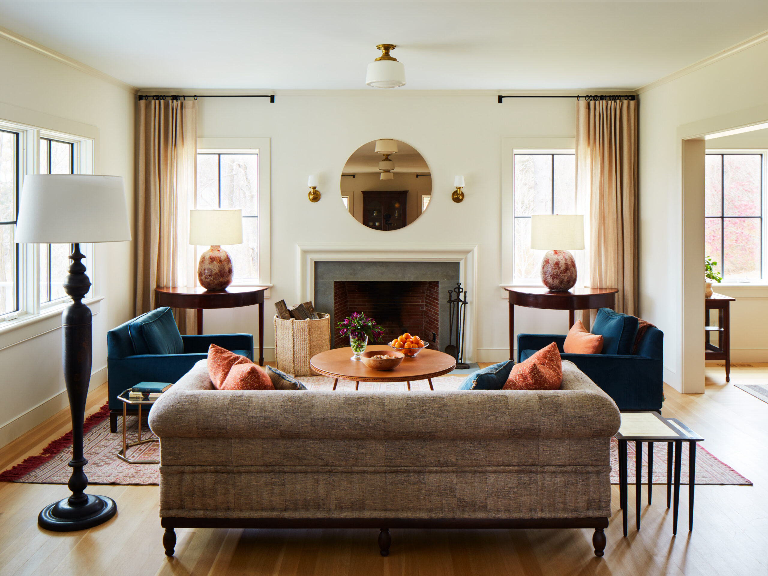
🌿 Warm Neutrals & Earthy Foundations

The core palette of 2026 leans into nature-driven neutrals: beige, sand, taupe, terracotta, and rich browns. These tones create cozy, grounded spaces and pair beautifully with natural materials like wood, stone, and linen. Soft greens—olive, moss, and sage—are especially popular for their calming, restorative feel.

🎭 Rich Accents with Personality

Rather than loud, high-contrast color, designers are using deep, moody accents to add character. Burgundy, wine red, plum, burnt orange, and deep blues are trending in cabinetry, furniture, and feature walls. These hues add sophistication without overwhelming the space.

🪶 Soft Pastels, Reimagined

Muted pastels are making a quiet comeback. Dusty rose, powder blue, and soft lavender are being used sparingly for a subtle, serene effect—ideal for bedrooms, bathrooms, and relaxed living areas.

🏡 The 2026 Color Mindset

This year’s palettes reflect a desire for homes that feel intentional and emotionally grounding. Whether you choose warm neutrals, earthy greens, or bold accent tones, 2026 interior design encourages mixing comfort with self-expression.


The Don’t Of A Room

May 8, 2025

When considering a room’s “don’ts,” avoid common design pitfalls like cohesion, overdone symmetry, color gone wrong, and shapes, lines, and forms. 

1. Lack of Cohesion: The room can’t decide what it is. Contemporary? Traditional? Does the item serve a purpose? Pay attention to all the elements in the room. Place items purposefully (E.g., Floor lamp next to chair/sofa).

2. Overdone Symmetry: It becomes redundant and uninteresting. You don’t have to have two of everything. The only exception is the master bedroom.

3. Color Gone Wrong: Understand the saturation/value of the color. Saturation is the purest shade of that color, the highest level. Value is when you brighten the color by adding white. (Ex: coffee, add milk color lightens). Use colors that will compliment the furniture. If one color pops out more than any other color, chances are the color is to saturated.

4. Lack of Attention to Shape, Line, and Form: The lines all go in the same direction (E.g., all vertical, vertical lamp, vertical stripes, tall vertical vase).

Alternative Upper Kitchen Cabinets

June 24, 2021

In the past upper cabinets in kitchens have always been closed doors. But in the past few years, there’s been a trend towards open shelves. At first, there was some resistance to that trend, but nowadays, more homeowners are incorporating some form of open shelves in their kitchen design, even if just a small area. It’s definitely a more creative way to design.


I personally love the look.