
When considering a room’s “don’ts,” avoid common design pitfalls like cohesion, overdone symmetry, color gone wrong, and shapes, lines, and forms.
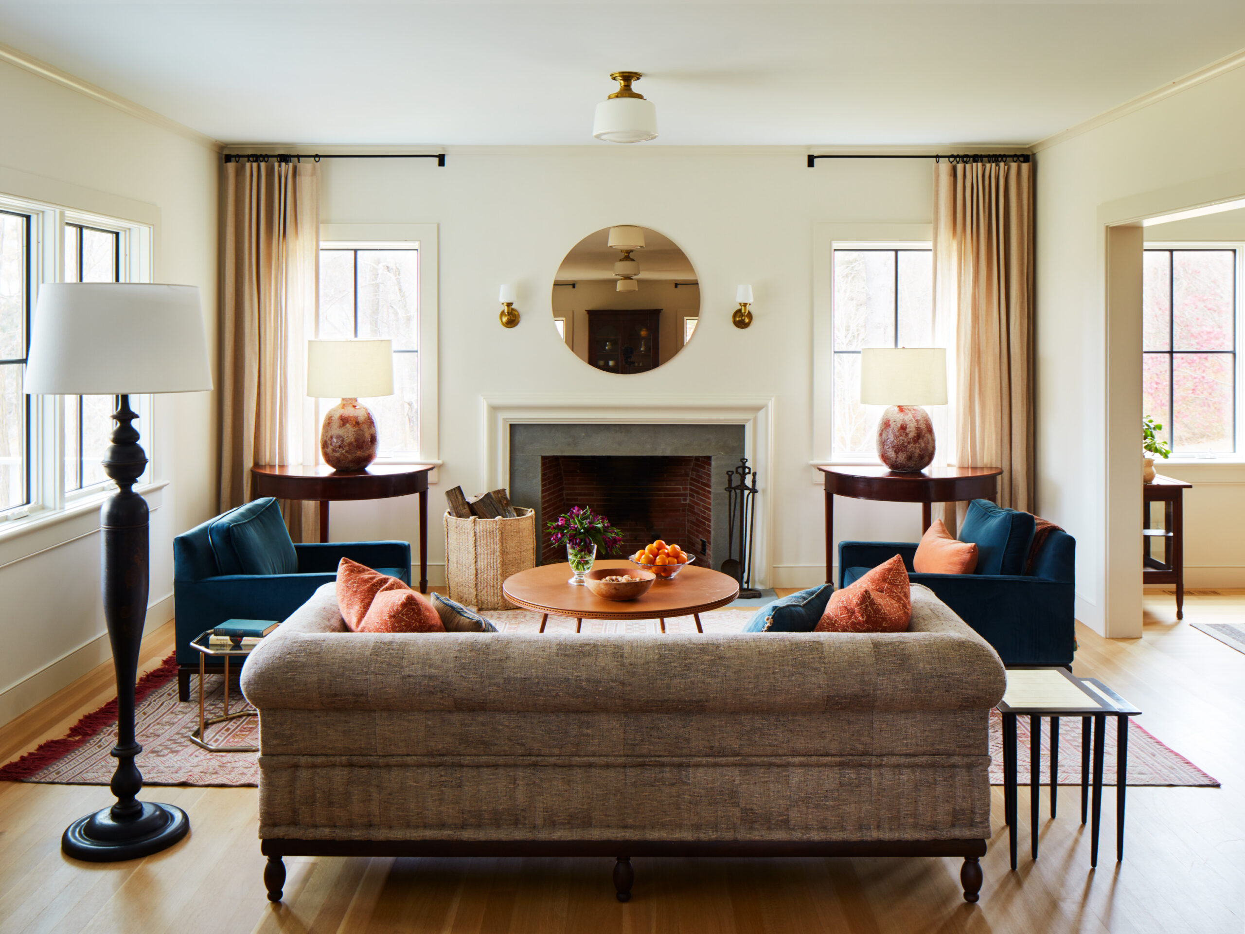
2. Overdone Symmetry: It becomes redundant and uninteresting. You don’t have to have two of everything. The only exception is the master bedroom.
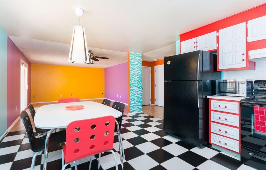
3. Color Gone Wrong: Understand the saturation/value of the color. Saturation is the purest shade of that color, the highest level. Value is when you brighten the color by adding white. (Ex: coffee, add milk color lightens). Use colors that will compliment the furniture. If one color pops out more than any other color, chances are the color is to saturated.
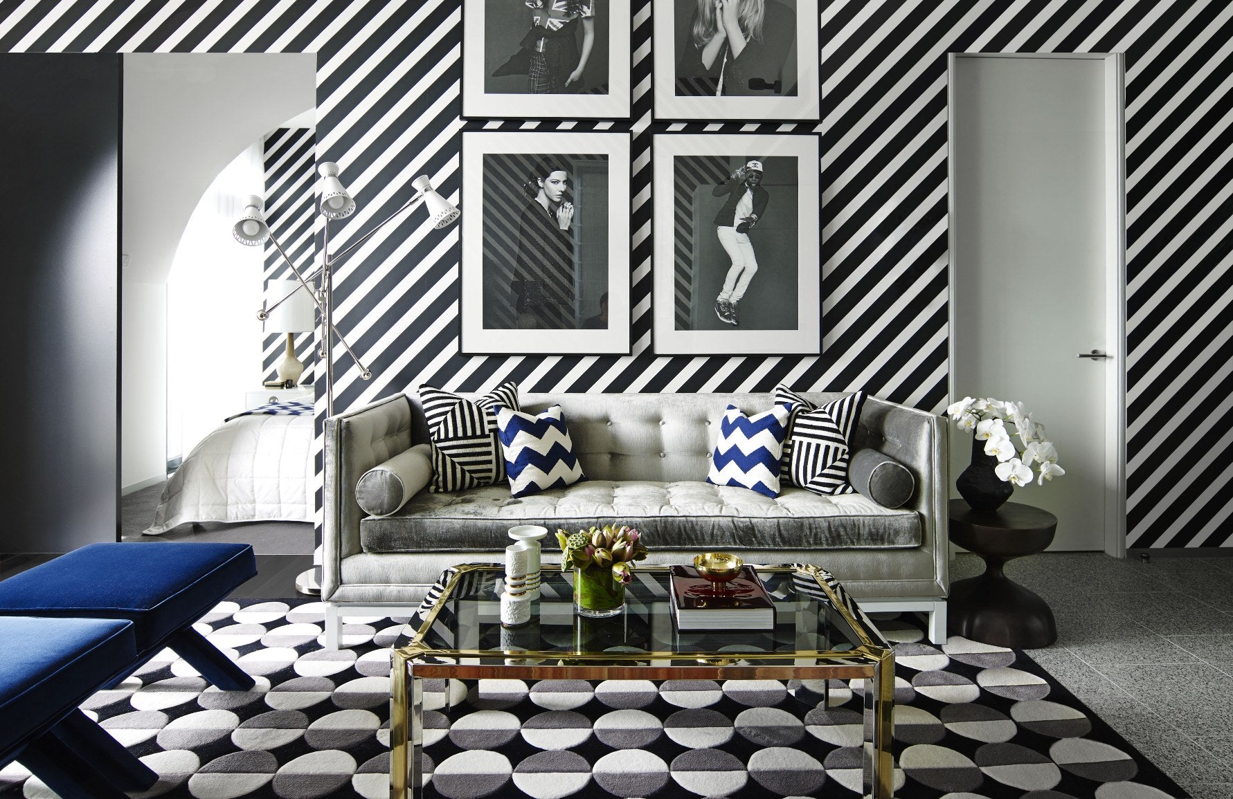
4. Lack of Attention to Shape, Line, and Form: The lines all go in the same direction (E.g., all vertical, vertical lamp, vertical stripes, tall vertical vase).